3D Transforms
Apply 3D perspective transforms to elements in the builder.
3D Transforms rotate and position elements in three-dimensional space by applying perspective, X/Y/Z rotations, and depth. Use them to build card flips, perspective tilts, barrel rolls, and any effect that makes an element feel like it exists in physical space rather than on a flat screen.
Where to find it
Left Panel → Animation tab → 3D Transform
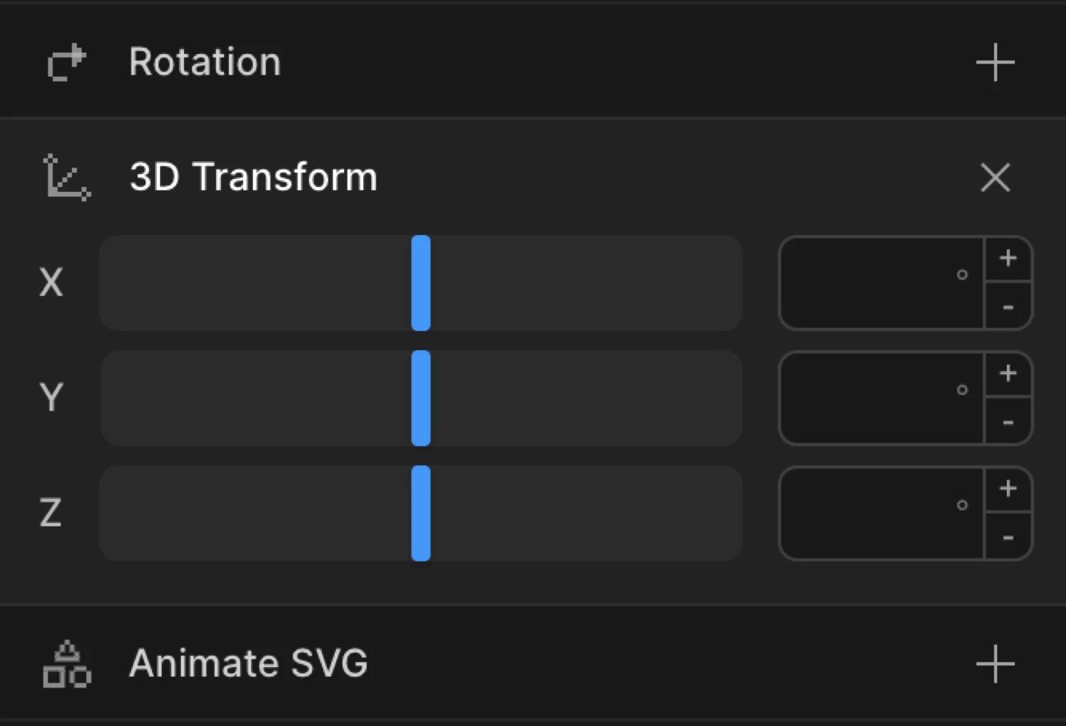
Enable the 3D Transform toggle to expand the controls. The section reveals inputs for three rotation axes — X, Y, and Z.
Controls
| Control | Unit | Description |
|---|---|---|
| Rotation X | deg | Tilts the element toward or away from the viewer around the horizontal axis. Positive = top tilts away, negative = top tilts toward the viewer. |
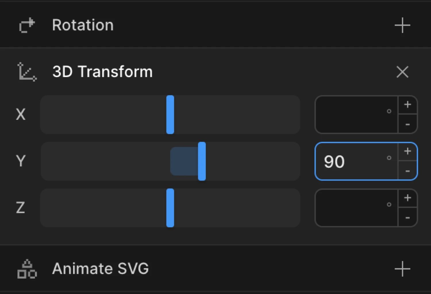
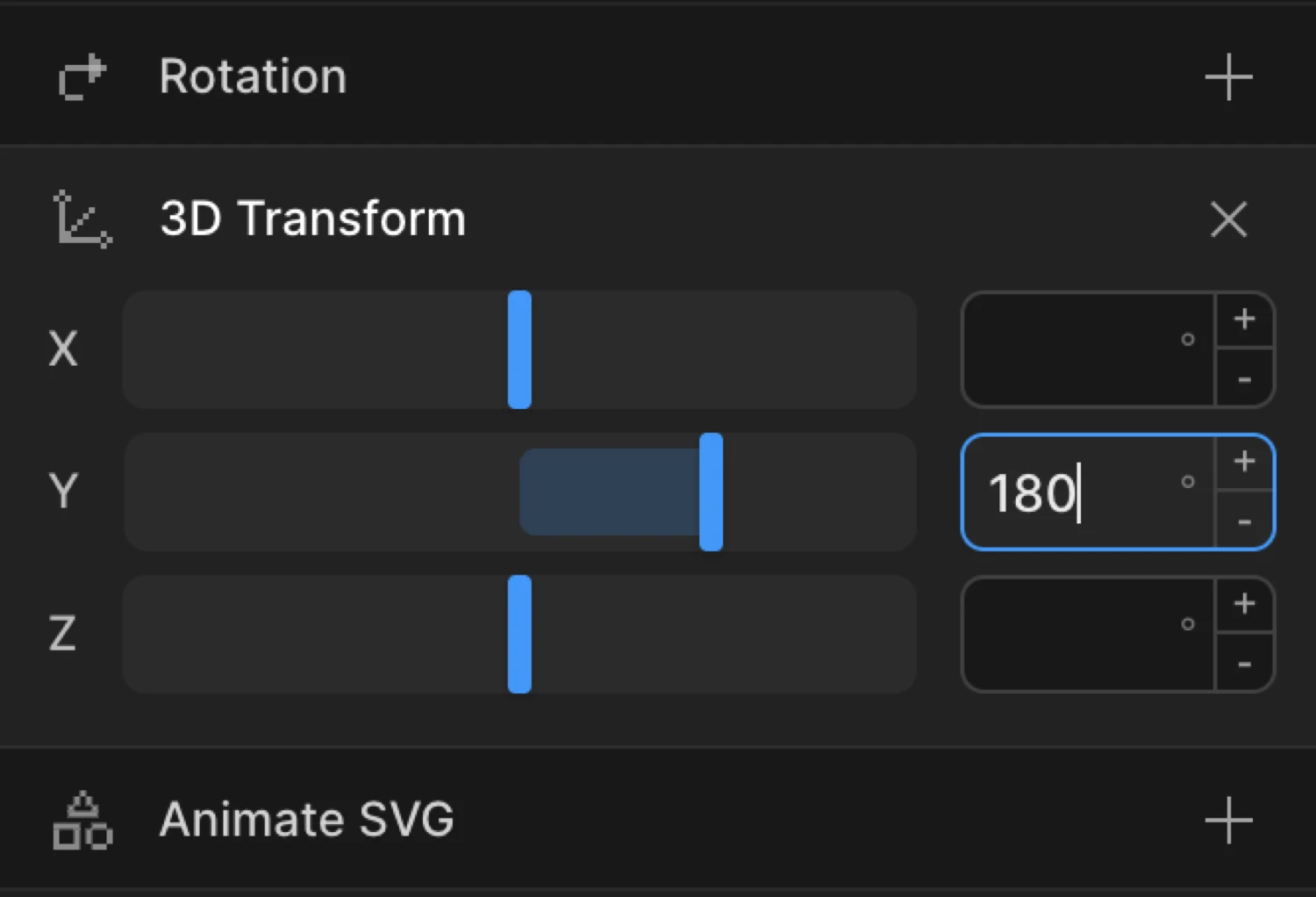
| Rotation Y | deg | Spins the element around the vertical axis. 180 rotates it to face backward — the back face of a card flip. |
| Rotation Z | deg | Rotates the element in the flat plane (identical to the 2D rotation property). |
Rotation inputs accept values from −360 to 360. Type directly into the input for values outside that range (e.g. −720 for a double spin).
From mode — 3D entrances
In From mode, the values you set are the starting transform. The element animates from that 3D state toward its natural CSS position.
Set rotationY to 90 in From to make an element swing in from the side — like a door opening. Set rotationX to −30 and add transformPerspective: 600 in your SDK code for a perspective tilt-down entrance.
To mode — flips and tilt effects
In To mode, the values you set are the ending transform. The element animates from its natural CSS position toward the 3D state you define.
Set rotationY to 180 in To for a card-flip exit. Combine with a paired second element (the card back) for a classic double-sided flip. Use rotationX at a small value like 5 in To with a Hover trigger and Reverse on leave for a subtle perspective tilt that responds to mouse hover.
The card uses transform-style: preserve-3d so both faces share the same 3D space. The back face starts at rotateY(180deg) and backface-visibility: hidden keeps each face invisible when it faces away from the viewer.
SDK equivalent
3D Transform properties map directly to SDK property names. The builder exposes rotationX, rotationY, and rotationZ. The SDK also supports perspective, transformPerspective, and transformStyle — set those in code when you need perspective depth or preserve-3d.
Card flip (From mode — swing in):
import { Motion } from '@motion.page/sdk';

Motion('card-flip', '.card', {
  from: { rotationY: 180, transformPerspective: 800 },
  duration: 1,
  ease: 'power2.inOut',
}).onScroll();
Perspective tilt-down entrance:
Motion('tilt-in', '.hero-card', {
  from: { rotationX: -40, transformPerspective: 600, opacity: 0 },
  duration: 0.8,
  ease: 'power3.out',
}).onPageLoad();
Hover perspective tilt (To mode):
Motion('tilt-hover', '.feature-card', {
  to: { rotationX: 6, rotationY: -8, transformPerspective: 700 },
  duration: 0.4,
  ease: 'power2.out',
}).onHover({ each: true, onLeave: 'reverse' });
Full barrel roll on scroll:
Motion('barrel-roll', '.icon', {
  from: { rotationY: -90, opacity: 0, transformPerspective: 500 },
  duration: 0.6,
  ease: 'back.out(1.5)',
}).onScroll();
For the complete reference see 3D Transforms in the SDK.
Common patterns
Card flip reveal on scroll
Enable 3D Transform on the From tab. Set rotationY to 90. Add Opacity at 0 on the same tab. Set the trigger to Scroll. In your CSS or SDK code, add transformPerspective: 800 for depth. Cards swing into view as they enter the viewport.
Motion('card-reveal', '.card', {
  from: { rotationY: 90, transformPerspective: 800, opacity: 0 },
  duration: 0.7,
  ease: 'power2.out',
}).onScroll();
Perspective tilt on hover
Set rotationX and rotationY to small values on the To tab with a Hover trigger and Reverse on leave enabled. Add transformPerspective in your SDK code for depth. The card subtly tilts toward the cursor and snaps back when the mouse leaves.
Motion('card-tilt', '.card', {
  to: { rotationX: 8, rotationY: -10, transformPerspective: 600 },
  duration: 0.35,
  ease: 'power2.out',
}).onHover({ each: true, onLeave: 'reverse' });
3D staggered list
Combine 3D Transform with Stagger. Set rotationX to −60 in From mode and add transformPerspective: 500 in your SDK code. Each list item unfolds from above in sequence, like turning pages.
Motion('list-unfold', '.list-item', {
  from: { rotationX: -60, transformPerspective: 500, opacity: 0 },
  duration: 0.55,
  ease: 'power3.out',
  stagger: 0.08,
}).onScroll();
Spin-in icon
Set rotationY to −360 in From mode. Add transformPerspective: 400 in your SDK code for depth. The element completes a full spin before settling into its natural facing direction.
Motion('spin-in', '.logo', {
  from: { rotationY: -360, transformPerspective: 400, opacity: 0 },
  duration: 1,
  ease: 'power2.out',
}).onPageLoad();
Tips
perspectivevstransformPerspective(SDK / CSS) —perspectiveis a CSS property applied to the parent; all children share the same vanishing point.transformPerspectiveapplies depth independently to each element — useful when elements are far apart in the DOM. Set these in your CSS or SDK code; they are not exposed in the builder UI.- Lower perspective = more dramatic depth.
400pxfeels exaggerated;1200pxfeels gentle. Start at800pxand adjust to taste. transform-style: preserve-3d— set this in CSS on any container whose children need to share a 3D space (e.g. the wrapper of a two-sided card).backface-visibility: hidden(set in CSS, not the builder) hides a face when it rotates past 90°. Essential for clean two-sided card flips.- Combine rotations sparingly. Rotating on multiple axes simultaneously produces gimbal effects that can look unnatural. For most UI work, stick to one or two axes.
- Double-click any input to reset its value.
- Pair
rotationXorrotationYentrances with Opacity at0— the fade masks the start of the rotation so it feels less abrupt.
Related
- 3D Transforms in the SDK — Full SDK reference for
rotationX,rotationY,rotationZ,transformPerspective, andtransformStyle - Rotation — Flat 2D rotation (
rotationZ) without perspective - Transform Origin — Change the pivot point for rotations and scale
- Scale — Grow or shrink elements; pairs well with 3D entrances
- Translate — Move elements on X, Y, and Z axes
- Ease — Control the motion curve;
power2.inOutandback.outsuit most 3D effects