Animate SVG
Animate SVG elements with DrawSVG, stroke color, and fill color in the builder.
Animate SVG lets you progressively reveal SVG strokes with DrawSVG, and independently animate the stroke and fill colors of any SVG element — making it the go-to tool for logo draw-ons, icon animations, and illustrated reveals.
Location
Left Panel → Animation tab → Visual Properties → Animate SVG
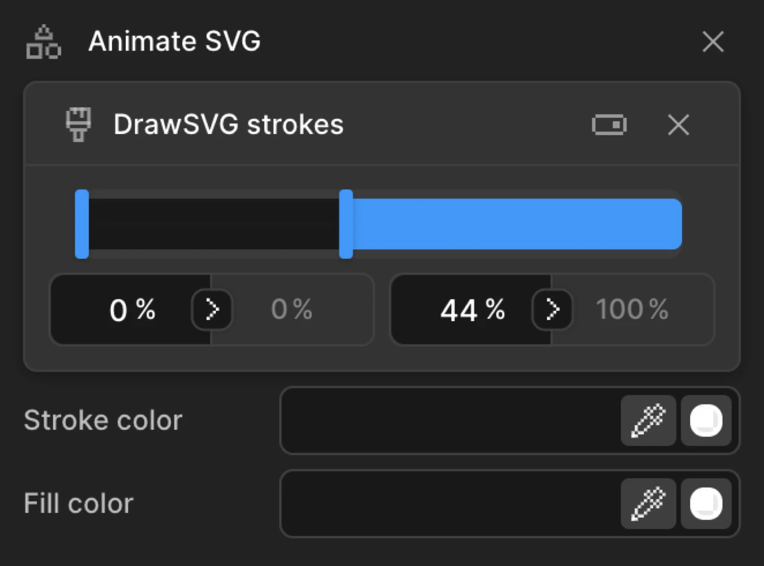
Enable Animate SVG
Click the toggle next to Animate SVG to enable it. The row expands to reveal three independently toggled sub-controls: DrawSVG, Stroke Color, and Fill Color. Enable only the ones you need — they work independently and can be combined freely.
Controls
| Control | Type | Description |
|---|---|---|
| DrawSVG — Start | Percentage input | Where the visible portion of the stroke begins (e.g. 0%). |
| DrawSVG — End | Percentage input | Where the visible portion of the stroke ends (e.g. 100%). |
| Stroke Color | Color picker | The color of the line drawn around the SVG element. Animates the stroke property. |
| Fill Color | Color picker | The color inside the SVG element. Animates the fill property. |
DrawSVG
DrawSVG progressively reveals or hides the strokes of an SVG element. It works by animating stroke-dasharray and stroke-dashoffset under the hood — the same technique used to hand-draw icons and logos on screen.
Two percentage inputs define the visible window of the stroke:
- Start % — where the visible portion begins along the stroke path
- End % — where the visible portion ends along the stroke path
The full stroke is visible when both values span the entire path. A fully hidden stroke has both values at the same point (e.g. both at 0% or both at 100%).
| State | Start | End | Result |
|---|---|---|---|
| Hidden (default From value) | 0% | 0% | Stroke is fully hidden |
| Fully visible | 0% | 100% | Entire stroke is drawn |
| Reversed (draw off) | 100% | 100% | Stroke is fully hidden from the end |
| Mid-reveal | 0% | 50% | First half of the stroke is visible |
DrawSVG applies to any SVG element that has a visible stroke: <path>, <line>, <circle>, <rect>, <polygon>, and <polyline>. Elements with fill only and no stroke will not animate visually.
Stroke Color
Enable Stroke Color to animate the outline color of the SVG element. Click the color swatch to open the color picker. The chosen color is set as the stroke CSS property and can transition from any starting color to any ending color.
Use Stroke Color in From mode to animate an element onto the screen with a color shift, or in To mode to react to hover or scroll with a color change.
Fill Color
Enable Fill Color to animate the interior color of the SVG element. The color picker sets the fill CSS property. Like Stroke Color, this can be used in From mode to set a starting color or in To mode to animate toward a target color.
From mode — draw on
Switch to the From tab, enable DrawSVG, and set Start to 0% and End to 0%. The stroke starts fully hidden and animates to its natural drawn state (0%–100%). This is the classic draw-on effect: the element appears to be sketched onto the screen in real time.
To animate Stroke Color from a starting color, enable it on the same From tab and pick the starting color. The element’s stroke will shift from that color to its natural CSS stroke color during the animation.
To mode — draw off
Switch to the To tab, enable DrawSVG, and set both Start and End to 100%. The stroke starts fully drawn and progressively erases from the end — a draw-off or erase effect. Use this for exit animations, loading indicators that drain, or progress bars that reverse.
The circle starts with its stroke fully hidden (drawSVG: '0% 0%') and animates to fully drawn (drawSVG: '0% 100%') — the From mode draw-on pattern.
SDK equivalent
DrawSVG, Stroke Color, and Fill Color map to the drawSVG, stroke, and fill properties in the SDK.
Draw on (From mode):
import { Motion } from '@motion.page/sdk';

Motion('logo-draw', '.logo path', {
  from: { drawSVG: '0% 0%' },
  duration: 1.4,
  ease: 'power2.inOut',
  stagger: { each: 0.12 },
}).onPageLoad();
Draw off (To mode):
Motion('draw-off', '.icon path', {
  to: { drawSVG: '100% 100%' },
  duration: 0.8,
  ease: 'power2.in',
}).onScroll({ scrub: true });
Stroke color shift (To mode):
Motion('icon-hover', '.nav-icon', {
  to: { stroke: '#FF6633' },
  duration: 0.25,
  ease: 'power1.out',
}).onHover({ each: true, onLeave: 'reverse' });
Draw on with simultaneous fill reveal:
Motion('icon-reveal', '.icon', {
  from: {
    drawSVG: '0% 0%',
    fill: 'transparent',
  },
  to: {
    fill: '#6633EE',
  },
  duration: 1.0,
  ease: 'power2.out',
}).onPageLoad();
For the full SDK reference, see SVG in the SDK.
Common patterns
Logo draw-on on page load
Enable DrawSVG on the From tab, set Start to 0% and End to 0%. Add a Stagger to sequence multiple paths. Set the trigger to Page Load. Each path draws on in sequence, creating the signature “sketched logo” entrance.
Motion('logo-entrance', '.logo path', {
  from: { drawSVG: '0% 0%', opacity: 0 },
  duration: 1.2,
  ease: 'power2.inOut',
  stagger: { each: 0.15 },
}).onPageLoad();
Icon color change on hover
Enable Stroke Color on the To tab and pick a highlight color. Set the trigger to Hover with Reverse on leave enabled. The icon stroke shifts to the highlight color on hover and reverts on mouse out.
Motion('icon-hover', '.nav-icon', {
  to: {
    stroke: '#FF6633',
    fill: '#FF220020',
  },
  duration: 0.2,
  ease: 'power1.out',
}).onHover({ each: true, onLeave: 'reverse' });
SVG line art reveal on scroll
Enable DrawSVG on the From tab with 0%–0%. Set the trigger to Scroll with Scrub enabled. The illustration draws itself in sync with the user’s scroll position — ideal for scrollytelling and editorial layouts.
Motion('line-art-scroll', '.illustration path', {
  from: { drawSVG: '0% 0%' },
  duration: 1,
  ease: 'none',
  stagger: { each: 0.05 },
}).onScroll({ scrub: true });
Progress ring drain
Set up a circular SVG progress ring. Enable DrawSVG on the To tab with both values at 0% 0%. Use the Set tab to pre-set the starting state (0%–100%). The ring drains as the animation plays — useful for countdown timers or progress indicators.
// Set the initial drawn state
Motion('ring-init', '.progress-ring', {
  set: { drawSVG: '0% 100%' },
}).onPageLoad();

// Then drain it
Motion('ring-drain', '.progress-ring', {
  to: { drawSVG: '0% 0%' },
  duration: 5,
  ease: 'none',
}).onPageLoad();
Related
- From, To & Set — How the three animation modes work and when to use each
- SVG in the SDK — SDK reference for
drawSVG,stroke, andfill - Opacity — Combine with DrawSVG for a combined fade and draw-on entrance
- Filter — Additional visual effects: blur, brightness, and more