Click Trigger
Configure click animations with toggle support.
The Click trigger plays a timeline when a specified element is clicked. By default, the animated element itself is the click target. Configure toggle behavior — reverse or restart — to control what the second click does.
Location
Left Panel → Trigger tab → Interactions → Click
Select Click from the trigger dropdown to reveal the click configuration panel.
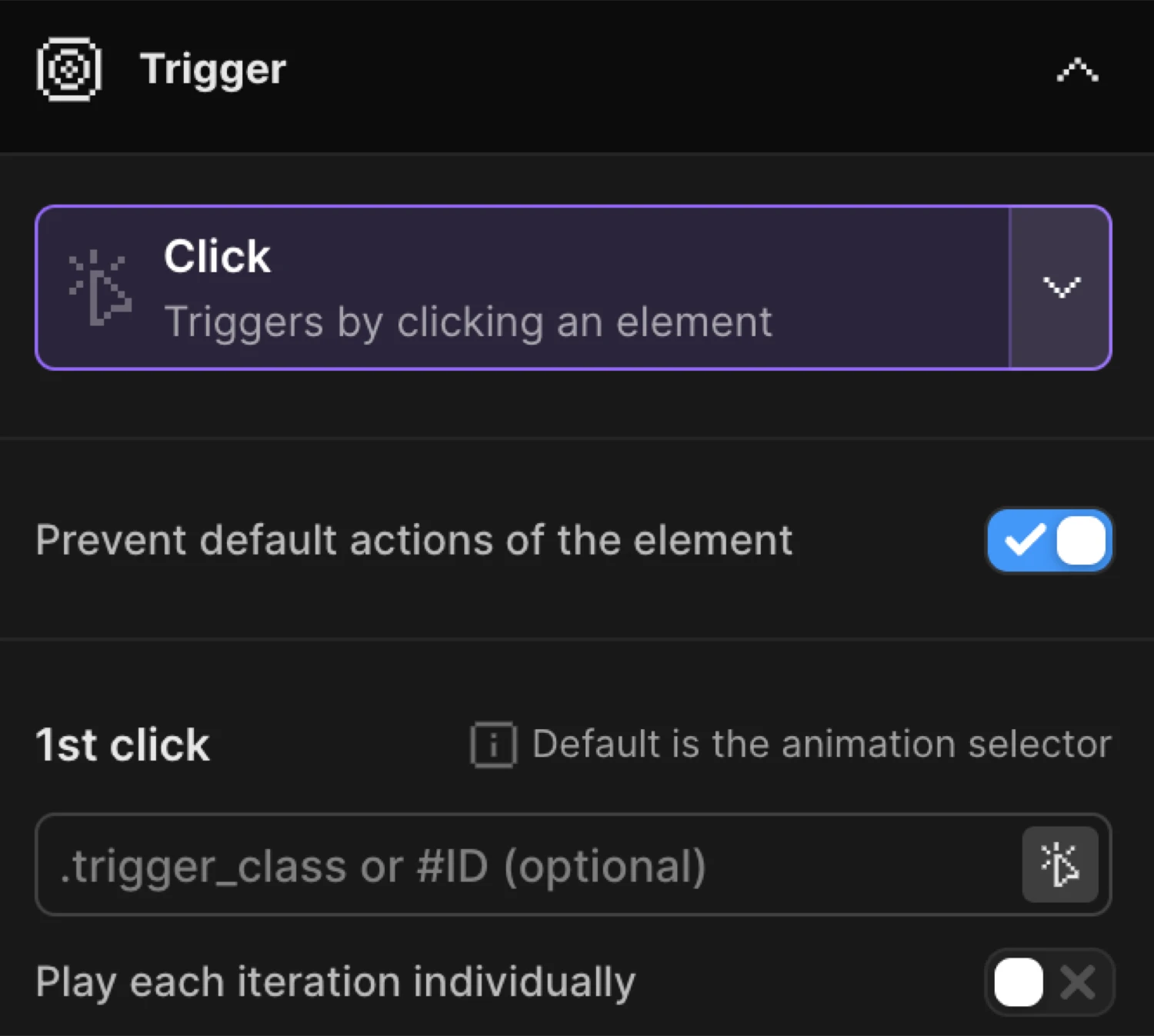
1st click
The 1st click section controls which element triggers the animation.
| Control | Description |
|---|---|
| Trigger selector | CSS selector for the click target. Leave empty to use the animation selector. Accepts .class or #id. |
| Play each iteration individually | When enabled, each matched element gets its own independent timeline instance — clicking one does not affect the others. |
Trigger selector follows the rule set by the mode:
- Single mode (each off) — pick any specific selector:
.trigger_class,#ID. Leave empty to default to the animation selector. - Each mode (each on) — the selector acts as a wrapper class. Elements inside each wrapper are targeted individually. Leave empty to use the animation selector as the wrapper.
Leave empty to use the animation selector as a click trigger or pick a specific selector that triggers the timeline.
By enabling Play each iteration individually, you can animate each iteration of the class individually one-by-one.
2nd click
The 2nd click section controls what happens when the element is clicked a second time.
| Control | Description |
|---|---|
| 2nd click selector | Optional separate element that triggers the second click action. Defaults to the 1st click selector when left empty. Only available when each is off. |
| Reverse animation | Plays the timeline backward on the second click. Alternates play/reverse on every subsequent click. |
| Restart animation | Replays the timeline from the beginning on the second click. No reverse. |
Reverse and Restart are mutually exclusive — enabling one disables the other. When both are off, repeated clicks play the animation forward from the current position each time.
Prevent default
The Prevent default actions of the element toggle disables the element’s native browser behavior on click — for example, preventing a link from navigating or a submit button from submitting a form.
Disable actions of the element on click, e.g. a link.
Enable this when the click target is an <a> tag or <button type="submit"> and the animation should take precedence over the default action.
Toggle behavior
| Mode | What the 2nd click does |
|---|---|
| Reverse on | Plays the timeline backward. Alternates play ↔ reverse on every click. |
| Restart on | Replays from the beginning. Each click always starts fresh. |
| Both off | Plays forward from the current position each time. |
Use Reverse for accordions, drawers, and toggles. Use Restart for flash effects, notifications, and one-shot reactions.
First click plays the animation forward. Second click reverses it — equivalent to enabling Reverse animation in the builder.
SDK equivalent
The builder Click trigger maps directly to .onClick() in the SDK.
import { Motion } from "@motion.page/sdk";

// Basic toggle — plays forward, then reverses on second click
Motion("panel", ".panel", {
  from: { height: 0, opacity: 0 },
  to: { height: "88px", opacity: 1 },
  duration: 0.38,
  ease: "expo.out",
}).onClick({ target: ".btn", toggle: "reverse" });
Restart on every click:
Motion("flash", ".notification", {
  to: { backgroundColor: "#ff4444", scale: 1.04 },
  duration: 0.25,
  ease: "power2.out",
}).onClick({ toggle: "restart" });
Each — independent per-element instances:
// Each card toggles independently
Motion("cards", ".card", {
  to: { y: -8, boxShadow: "0 12px 32px rgba(0,0,0,0.2)" },
  duration: 0.3,
  ease: "power2.out",
}).onClick({ each: true, toggle: "reverse" });
Prevent default on a link:
Motion("lightbox", ".lightbox", {
  from: { opacity: 0, scale: 0.92 },
  duration: 0.35,
  ease: "power2.out",
}).onClick({
  target: "a[data-lightbox]",
  toggle: "reverse",
  preventDefault: true,
});
For the full SDK reference see Click Trigger in the SDK.
Common patterns
Accordion / drawer
Set a selector for the expandable element. Enable Reverse animation. On the first click, the panel opens; on the second, it collapses.
Per-card hover-like expand
Enable Play each iteration individually so each card in a grid expands and collapses independently without affecting sibling cards.
Rotate icon on toggle
Add Rotate on the To tab with a value of 180. Enable Reverse animation. The icon spins to 180° and back on each click — useful for chevrons next to dropdowns.
Related
- Click Trigger in the SDK — Full SDK reference for
.onClick() - Hover Trigger — Trigger animations on mouse enter and leave
- Page Load Trigger — Auto-play on DOM ready
- From, To & Set — Configure what the animation does