Custom Cursor
Create custom cursor effects with smooth movement, state-based styling, hover targets, and multiple cursor instances.
The Custom Cursor trigger replaces the browser’s default cursor with one or more styled HTML elements that follow the pointer. Each cursor instance is independently animated with configurable smoothing, squeeze effects, and CSS-driven state transitions for default, hover, and pressed states.
Location
Left Panel → Trigger tab → trigger type dropdown → Mouse Follower
Preset selection
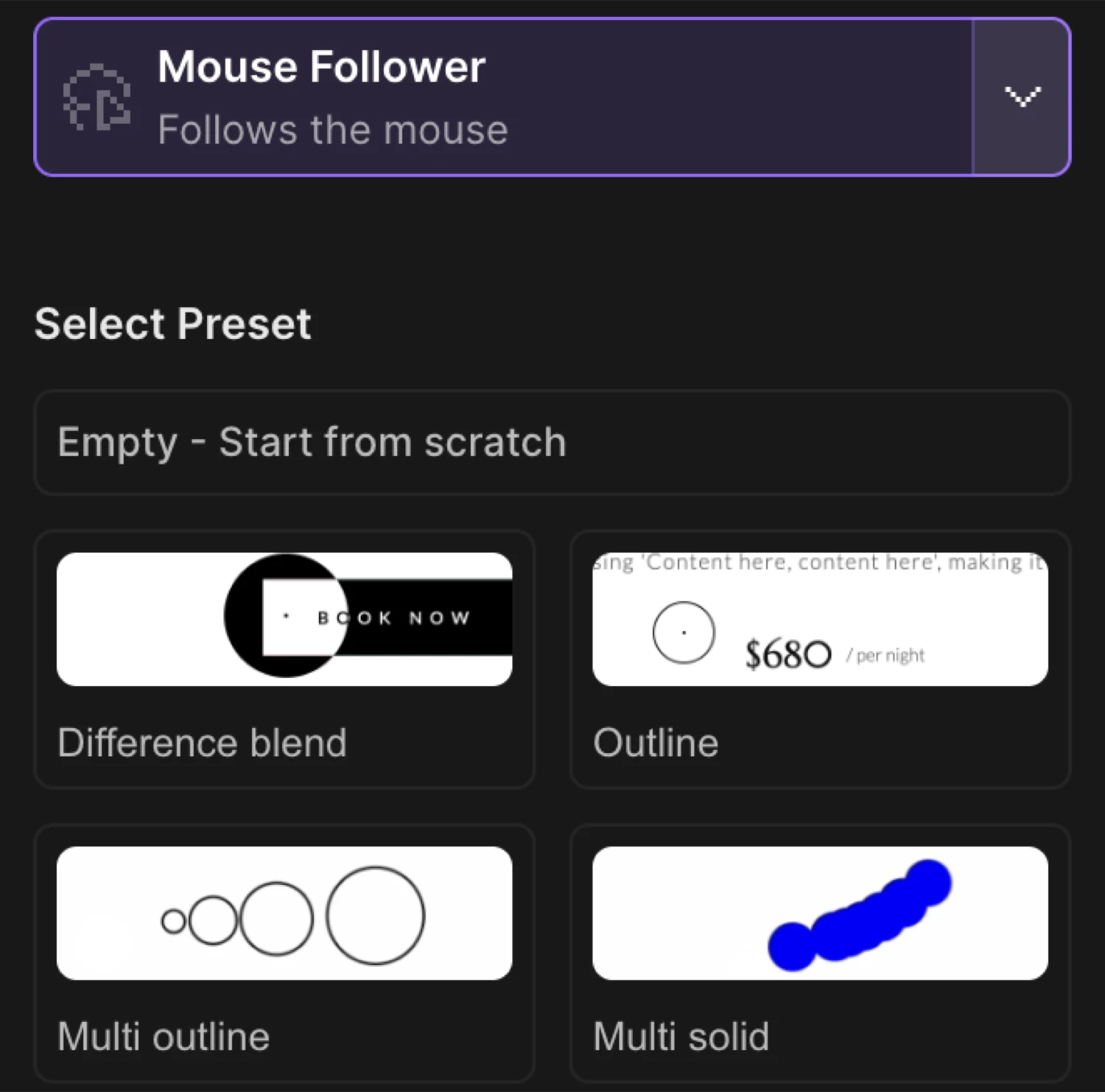
The builder ships with 14 presets to start from. Choose a preset, then customize each instance’s properties to match your design.
| Preset | Description |
|---|---|
basic | Semi-transparent circle (smooth: 0.35) + instant solid dot (smooth: 1) |
outline | Ring outline that expands on hover over a elements |
differenceBlend | Two layers with mix-blend-mode: difference for an inverted color effect |
multiOutline | Four concentric outline rings with staggered smooth values (0.45–0.6) |
multiSolid | Seven solid dots with decreasing smooth values, fading on hover |
outlineCross | Ring + crosshair lines that grow on hover |
cross | Two rectangular bars forming a plus shape |
blurred | Frosted-glass circle using backdrop-filter: blur() |
invert | backdrop-filter: invert(100%) — inverts content behind the cursor |
radialGradient | Full-viewport BasicCursor with a radial gradient centered on the pointer |
tooltip | TooltipCursor — shows tooltip text near the cursor |
text | TextCursor — reveals a text label on hover |
media | MediaCursor — displays an image or video that appears on hover |
empty | Minimal 5 px dot, a blank canvas for custom styling |
Pick a preset and tweak it — the full instance list becomes editable once a preset is applied.
Cursor instance settings
Each cursor is made up of one or more instances. Every instance follows the mouse independently and renders as its own DOM element.
Smooth
Adjust the smoothness of cursor movement. Lower values create a more fluid, delayed effect, while higher values make the cursor more responsive.
| Control | Range | Description |
|---|---|---|
| Smooth slider | 0 – 1 | 0 = maximum fluid delay; 1 = instant, no lag |
A value of 0.4 gives a natural, slightly delayed feel. Use 1 on a small dot that should sit exactly under the pointer.
Squeeze
Enable the squeeze effect to animate the cursor size when moving mouse.
Toggle Squeeze to enable an inertia-driven squash and stretch animation as the cursor accelerates. Works well on circular shapes.
Instance type
The underlying cursor renderer is set per instance. Each type extends the base with extra capability:
| Type | Extra capability |
|---|---|
BasicCursor | Plain HTML element, full CSS control |
OutlineCursor | Same as Basic — commonly used for bordered rings |
InvertCursor | Pre-wired for backdrop-filter invert effects |
TextCursor | Adds a Text properties section for the text node |
MediaCursor | Adds a Media properties section for the img/video element |
TooltipCursor | Renders tooltip markup attached to the cursor |
Cursor states
Each instance has three states. States layer on top of each other using CSS property overrides animated by the SDK.
Default state
Adjust the styles of the cursor when it is in default state.
The Default state is always active — it defines the base appearance. Toggle it off to disable the instance entirely.
Add CSS property key/value pairs (e.g. width: 40px, border-radius: 50%, background-color: black). Set a Transition duration in seconds to control how fast the element animates back to default after leaving another state.
Hover state
Adjust the styles of the cursor when it is in hover state.
Enable the hover state of the cursor.
Enable the Hover toggle to activate this state. When the pointer enters any hover target, the SDK transitions the cursor element to the hover CSS properties.
| Sub-control | Description |
|---|---|
| CSS properties | Key/value pairs that override or extend the default state |
| Hover targets | CSS selectors for elements that trigger this state |
| Transition duration | Speed (seconds) of the transition into hover |
Adjust the duration of the animation transition when transitioning to selected state.
Pressed state
Adjust the styles of the cursor when it is in pressed state.
Enable the pressed state of the cursor.
Enable Pressed to activate a state on mousedown. Define CSS property overrides and a transition duration. Useful for a shrink or color flash on click.
Hover targets
Select the elements that will trigger the hover state of the cursor.
Hover targets are CSS selectors that tell the cursor when to switch into its hover state. Add one selector per row.
Common values:
| Selector | What it matches |
|---|---|
a | All anchor links |
button | All button elements |
img | All images |
.interactive | Elements with a custom class |
[data-cursor="hover"] | Elements with a data attribute |
Leave the targets array empty if you want the hover state to never activate (or use it only with the pressed state).
Text properties
Available on TextCursor instances.
Adjust the CSS properties of the text.
Add CSS property rows to style the inner text node: font-size, color, font-weight, letter-spacing, etc. The text content itself is set by the element being hovered (via a data-cursor-text attribute on the target element).
Media properties
Available on MediaCursor instances.
Adjust the CSS properties of the image or video element.
Add CSS rows to style the embedded media element inside the cursor: width, height, border-radius, object-fit, opacity, etc. The media source is provided by the hovered element via a data-cursor-media attribute.
Multiple instances
Add a new instance of the cursor.
A single Custom Cursor trigger can have multiple instances — each one is an independent DOM element that follows the pointer with its own smooth value, CSS styles, and states. Layers stack to create depth and trailing effects.
Click + Add instance to add another layer.
Example — basic preset (two instances):
| Instance | Type | Smooth | Description |
|---|---|---|---|
| 1 | BasicCursor | 0.35 | 30 px semi-transparent circle with squeeze, expands on hover |
| 2 | BasicCursor | 1 | 5 px solid dot, instant — sits exactly under the pointer |
The larger circle has inertia; the dot has none. The result: the dot snaps to the cursor while the ring trails behind.
Example — multiOutline preset (four instances):
| Instance | Smooth | Size |
|---|---|---|
| 1 | 0.45 | 40 px ring |
| 2 | 0.50 | 30 px ring |
| 3 | 0.55 | 20 px ring |
| 4 | 0.60 | 10 px ring |
The four rings follow at slightly different speeds, creating a ripple trail. Each shrinks to 80 px on hover.
Disable native cursor
Hide the native cursor.
Toggle Disable native cursor to hide the browser’s built-in cursor (cursor: none). Enable this whenever you want the custom cursor to fully replace the system pointer — otherwise both cursors appear simultaneously.
SDK equivalent
The builder Custom Cursor maps to .cursor() in the SDK. See Custom Cursor — SDK reference.
import { Motion } from "@motion.page/sdk";

Motion("cursor").cursor({
  instances: [
    {
      type: "outline",
      smooth: 0.4,
      squeeze: true,
      default: {
        width: "40px",
        height: "40px",
        borderRadius: "50%",
        border: "1px solid black",
        backgroundColor: "transparent",
      },
      hover: {
        targets: ["a", "button"],
        width: "80px",
        height: "80px",
        transition: { duration: 0.3 },
      },
    },
  ],
  disableNative: true,
});
Common patterns
Difference blend cursor
Use the differenceBlend preset. Both instances carry mix-blend-mode: difference with a white background — anywhere the cursor passes over light content it shows dark, and over dark content it shows white. No hover target configuration needed; the blend does the visual work.
Great for creative portfolios where the cursor should interact visually with every element on the page.
Text label on hover
Use the text preset (TextCursor). The cursor is invisible by default (opacity: 0). Add a data-cursor-text="View project" attribute to the elements you want to label. When the pointer enters a hover target, the cursor expands and fades in with the label text.
Configure the Text properties section to set font-size, color, and font-family.
Media preview on hover
Use the media preset (MediaCursor). Add data-cursor-media="/path/to/image.jpg" (or .mp4) to gallery items or cards. The cursor starts hidden (transform: scale(0)) and scales in on hover, displaying the media.
Use the Media properties section to set border-radius, object-fit: cover, and size.
Multi-layer trailing effect
Stack three or more OutlineCursor instances with incrementally lower smooth values (e.g. 0.45, 0.55, 0.65). Each ring lags slightly more than the one before, producing a comet-tail effect. Apply the same hover target and property overrides to all layers so they expand in unison.
Related
- Custom Cursor — SDK reference —
.cursor()API and full options - Hover Trigger — Trigger animations on pointer enter
- Click Trigger — Trigger animations on element click
- Page Load Trigger — Auto-play animations when the page loads
- Left Panel — Full Left Panel reference including the Trigger tab