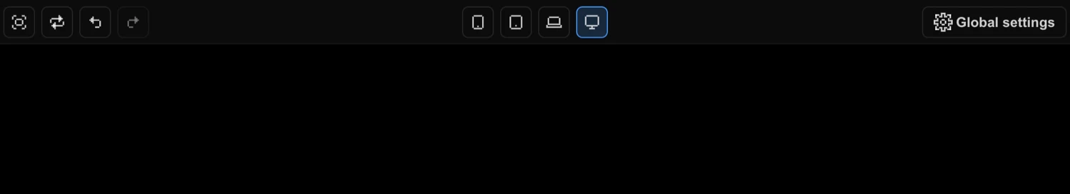
Top Panel
Toolbar controls — undo/redo, device preview, zoom, playback, theme, and CDN toggle.
The Top Panel sits at the top of the Workspace and provides quick access to undo/redo, device preview, and global settings. Additional playback and zoom controls appear in the Timeline Editor bar.
Left Controls
The left column of the Top Panel contains controls for managing your workspace view and editing history.
- Fullscreen — Expands the preview iframe to fill the screen. Tooltip: “Full screen”
- Refresh — Reloads the preview iframe. Tooltip: “Refresh”
- Undo — Reverts the last action. Grayed out when no history is available. Tooltip: “Undo last action”
- Redo — Re-applies an undone action. Grayed out when no future states exist. Tooltip: “Redo last action”
| Control | Shortcut | Description |
|---|---|---|
| Fullscreen | — | Expand preview to full screen |
| Refresh | — | Reload the preview iframe |
| Undo | Cmd/Ctrl + Z | Revert the last action |
| Redo | Cmd/Ctrl + Shift + Z | Re-apply an undone action |
Tip:
Cmd/Ctrl + Yis an alternative shortcut for Redo — useful ifCmd/Ctrl + Shift + Zconflicts with another binding.
A history dropdown is available for browsing past actions. The dropdown also exposes a Clear all undo/redo history option (tooltip: “Clear all undo/redo history”).
Actions that occur within 500ms are batched into a single history entry: node move, node resize, and animation property updates.
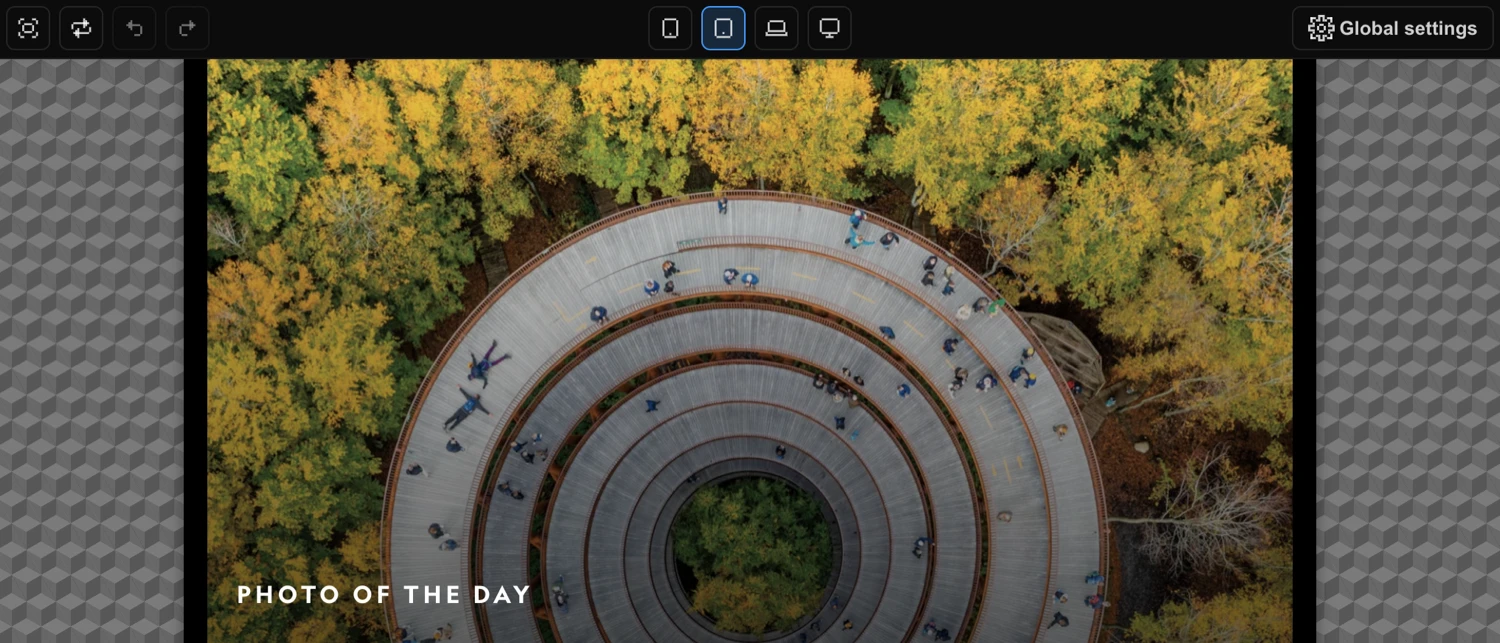
Device Preview
The center column contains four breakpoint buttons that set the preview iframe width to simulate different screen sizes. The active device is highlighted.
| Button | Tooltip | Behavior |
|---|---|---|
| Mobile | ”Mobile” | Preview at phone breakpoint width |
| Tablet | ”Tablet” | Preview at tablet breakpoint width |
| Laptop | ”Laptop” | Preview at laptop breakpoint width |
| Desktop | ”Desktop” | Preview at full width |
The actual pixel values for each breakpoint are defined in your Global Settings. Switching device does not affect your animations — it only resizes the preview iframe.
Global Settings
The Settings cog on the right side opens the Global Settings panel. Several toggles here affect the builder experience directly.
Theme Toggle
Switches the builder between dark and light theme. Tooltip: “Switch between the dark or light theme of the builder”. The selected theme is stored persistently across sessions.
CDN Toggle
Enables or disables loading animation files from the CDN instead of locally. Tooltip: “Enable / disable loading files from CDN, instead of locally.” Disable this when working offline or testing against local builds.
Tooltips Toggle
Enables or disables tooltip display throughout the builder. Tooltip: “Enable / disable display of tooltips”. Turn this off once you are familiar with the interface to reduce visual noise.
Timeline Playback Controls
These controls live in the bar directly above the Timeline Editor. They let you drive animation playback without leaving the builder.
- Add Node (+) — Adds a new animation node to the timeline. Tooltip: “Add an animation node”
- Loop — Toggles looping playback during preview. Tooltip: “Preview in a loop”
- Jump to Start — Moves the playhead to the beginning of the timeline. Tooltip: “Jump to start”
- Play / Pause — Toggles playback and displays the current time and total duration with a progress bar. Tooltip: “Play / Pause”
- Jump to End — Moves the playhead to the end of the timeline. Tooltip: “Jump to end”
- Live — When enabled, animations execute live on the page to preview trigger behavior (scroll, click, hover). Hidden for the Page Events trigger. Tooltip: “If enabled, animations are executed live on the page for preview of a trigger (scroll, click, hover).”
| Control | Description |
|---|---|
| Add Node | Add a new animation node |
| Loop | Toggle looping playback |
| Jump to Start | Move playhead to the beginning |
| Play / Pause | Toggle playback; shows current time / total duration |
| Jump to End | Move playhead to the end |
| Live | Execute animations live on the page for trigger preview |
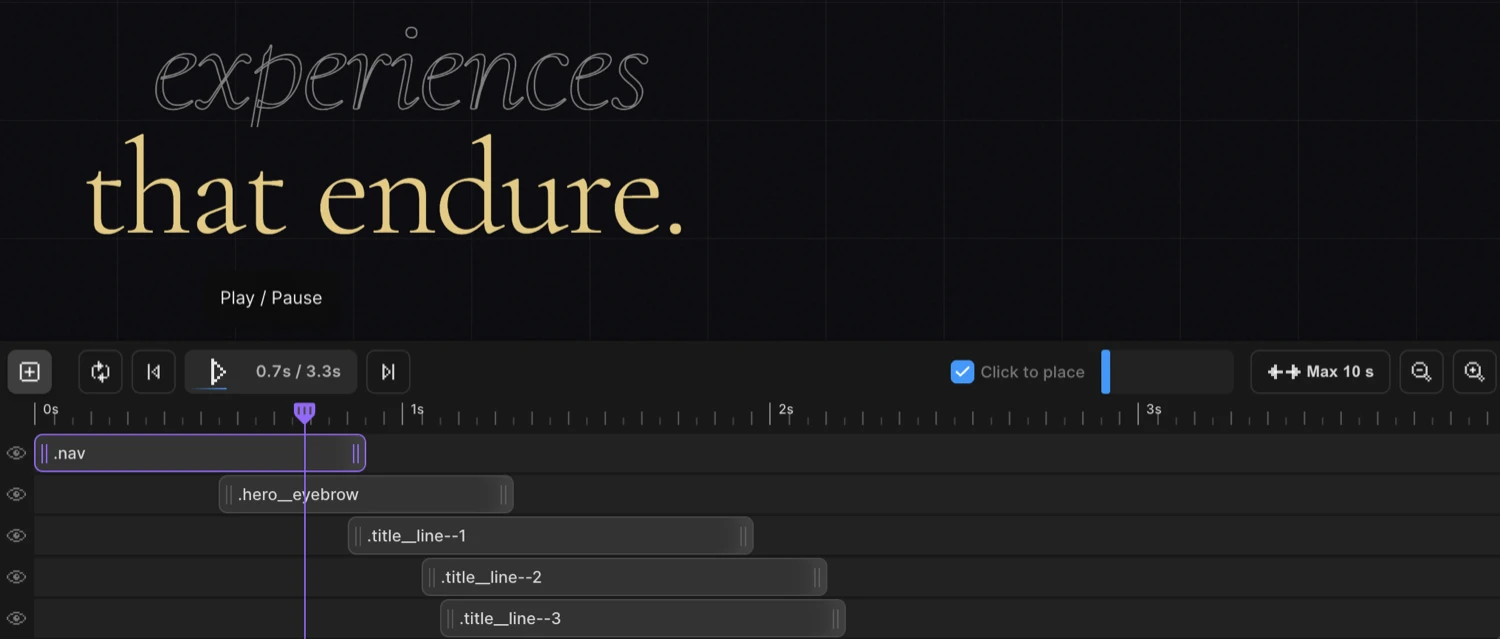
Zoom & Timeline Controls
The right side of the timeline bar contains controls for navigating and scaling the timeline view.
- Click to Place — Toggle checkbox that enables placing nodes on the timeline by clicking. Tooltip: “Toggle click-to-place nodes on timeline”
- Timeline Scrollbar — Slider for scrolling through the timeline horizontally. Tooltip: “Scrollbar of your timeline.”
- Max Columns — Sets the maximum timeline length, cycling from 10s to 70s in 10s steps. Tooltip: “Maximum length of the timeline editor. Click and drag to change.”
- Zoom Out — Decreases the zoom level (minimum 0.2×). Tooltip: “Zoom out of the timeline”
- Zoom In — Increases the zoom level (maximum 3.4×). Tooltip: “Zoom in on the timeline”
| Control | Description |
|---|---|
| Click to Place | Toggle click-to-place mode for adding nodes |
| Timeline Scrollbar | Scroll horizontally through the timeline |
| Max Columns | Set maximum timeline length (10s–70s in 10s steps) |
| Zoom Out | Decrease timeline zoom (min 0.2×) |
| Zoom In | Increase timeline zoom (max 3.4×) |
Tip: Both Zoom In and Zoom Out support click-and-hold for continuous zoom — you do not need to click repeatedly.
Keyboard Shortcuts Summary
| Shortcut | Action |
|---|---|
Cmd/Ctrl + Z | Undo |
Cmd/Ctrl + Shift + Z | Redo |
Cmd/Ctrl + Y | Redo (alternative) |
Cmd/Ctrl + S | Save timeline |
Fullscreen Mode
When Fullscreen is active, a floating control overlay appears directly over the preview. It mirrors the core timeline playback controls so you can drive animations without returning to the builder:
- Loop toggle
- Jump to Start
- Play/Pause with timer
- Jump to End
Exit fullscreen to return to the full builder interface.