Breakpoint Sizes
Set the pixel thresholds that define each device tier across the builder.
Motion.page uses three named breakpoints — phones, tablets, and laptops — to define the four device tiers (phone, tablet, laptop, desktop). These thresholds drive the device preview in the builder and the device variants on your published site.
Editing per device? This page only covers the pixel sizes. To tune a timeline differently on each device, see Responsive Editing.
Location
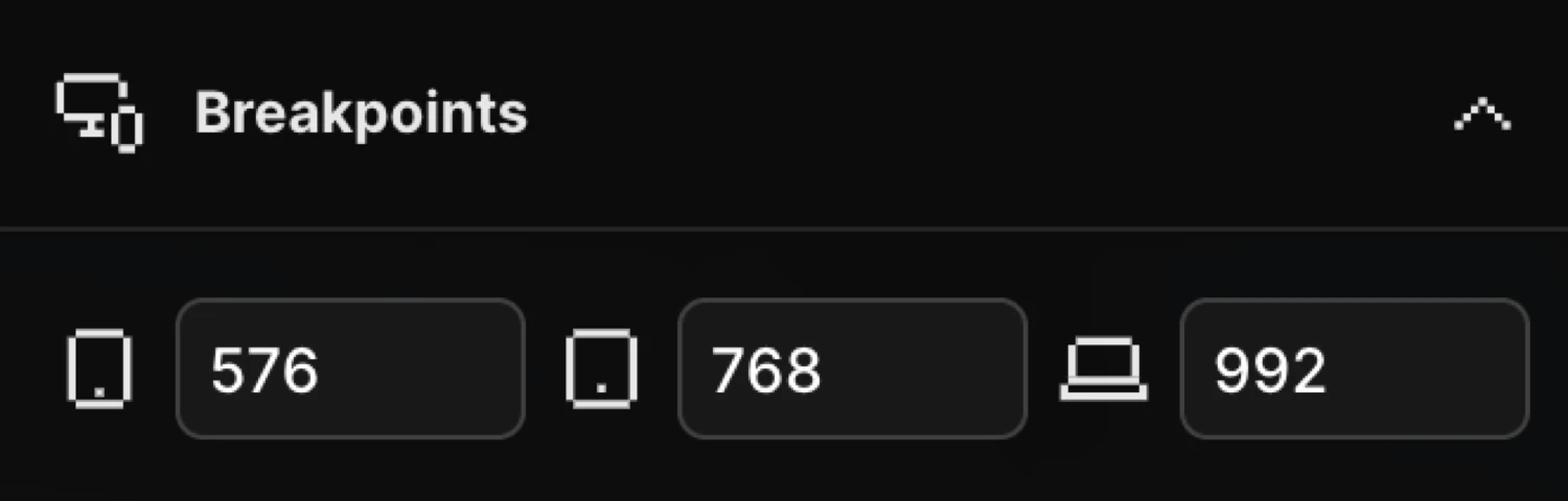
Settings panel → Breakpoints
Open the Settings panel (gear icon in the top-right toolbar). The Breakpoints section shows three pixel inputs, one for each device tier.
Defaults
| Device | Key | Default (max-width) |
|---|---|---|
| Phones | phones | 576 px |
| Tablets | tablets | 768 px |
| Laptops | laptops | 992 px |
All values use a max-width query. A viewport narrower than or equal to a value falls into that tier or smaller; anything wider than laptops is treated as desktop. The four resulting tiers are strictly non-overlapping, so exactly one applies at any width:
| Tier | Range |
|---|---|
| Desktop | wider than laptops |
| Laptop | tablets + 1 up to laptops |
| Tablet | phones + 1 up to tablets |
| Phone | up to phones |
Changing the values
Click any input and type a new pixel value, or scroll the mouse wheel over the input to increment or decrement by 1. Changes take effect after a short debounce and are saved as part of the global site options — they apply to all timelines and to the device preview.
Tip: Match your theme’s grid system — Bootstrap uses 576 / 768 / 992, Tailwind uses 640 / 768 / 1024.
Device preview
The pixel values power the device preview buttons in the Top Panel. Clicking a device icon resizes the Frame View to the corresponding width:
| Button | Frame width |
|---|---|
| Mobile (phone icon) | phones px |
| Tablet (tablet icon) | tablets px |
| Laptop (laptop icon) | laptops px |
| Desktop (monitor icon) | Full width |
Updating a breakpoint value immediately updates these preview widths, so you always preview at the exact sizes your theme uses.
Related
- Responsive Editing — Edit a timeline per device using these tiers
- Breakpoints in the SDK — The same thresholds in SDK code
- Top Panel — Device preview controls