Custom Properties
Animate any CSS property using the Custom Properties panel in the builder.
Custom Properties lets you animate any CSS property that isn’t covered by the built-in property panels — from border-radius and letter-spacing to box-shadow and padding.
Location
Left Panel → Animation tab → Visual Properties → Custom
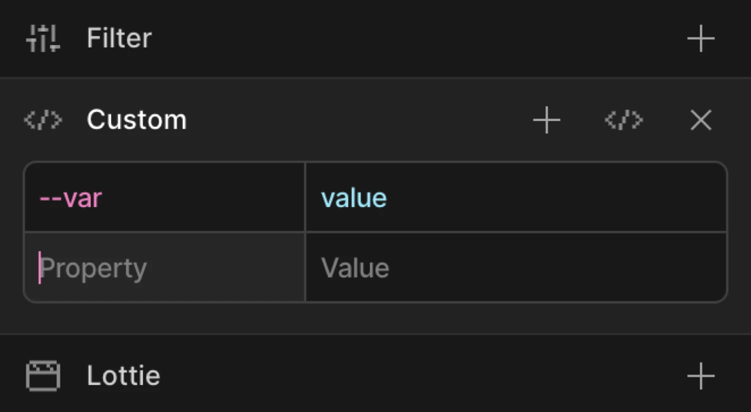
Enable Custom Properties
Click the toggle next to Custom to enable it. The row expands to show a two-column input with a Property field and a Value field.
Controls
| Control | Description |
|---|---|
| Property input | The CSS property name. Accepts camelCase (borderRadius) or kebab-case (border-radius). |
| Value input | The target value for the property. Accepts any valid CSS value string or number. |
Add row button (+) | Appends a new empty Property/Value row. Use this to animate multiple custom properties in one animation step. |
| Code field toggle | Switches the panel between Key/Value mode and Advanced Code Field mode. The icon is a </> code symbol. |
| Right-click context menu | Right-click any row in column view to Duplicate, Copy, Paste, or Delete row. The last remaining row cannot be deleted. |
Key/Value mode (default)
Each row has two inputs side by side:
- Property — the CSS property you want to animate, e.g.
border-radius,letter-spacing,padding-top - Value — the CSS value to animate to (or from), e.g.
50%,0.2em,24px
Use camelCase or kebab-case for the property name — both resolve correctly. When you enter a value that contains a cubic-bezier() expression or a four-number easing string, the builder normalises the decimal format automatically.
Click the + button in the panel header to append additional rows. Each row animates a separate CSS property within the same tween.
Advanced Code Field mode
Click the code field icon (the </> button) to switch to Advanced Code Field mode. This replaces the row inputs with a freeform code editor that accepts any valid from/to object key-value pairs.
Use the Advanced Code Field when:
- You need to enter complex multi-value strings like
box-shadoworbackdrop-filter - You want to paste properties copied from existing SDK code
- You need to enter properties with special formatting that the row inputs make awkward
Click the code field icon again to toggle back to Key/Value mode.
From mode — animate from a custom value
Switch to the From tab, enable Custom, and add property/value pairs. The element starts at those values and animates to its natural CSS state.
Example: set border-radius to 0 on the From tab. If the element’s CSS has border-radius: 50%, it starts as a sharp square and morphs into a circle.
To mode — animate to a custom value
Switch to the To tab, enable Custom, and set the target property/value. The element starts at its natural CSS state and animates to the specified value.
Example: set border-radius to 50% on the To tab. The element morphs from whatever its CSS defines into a circle.
The box starts with border-radius: 0 (the From value) and animates to border-radius: 50% — a full circle.
SDK equivalent
Custom Properties map directly to any key-value pair in the from and to objects of the SDK.
Border-radius morph (From mode):
import { Motion } from '@motion.page/sdk';

Motion('circle-in', '.avatar', {
  from: { borderRadius: '0%' },
  to:   { borderRadius: '50%' },
  duration: 0.8,
  ease: 'power2.out',
}).onPageLoad();
Letter-spacing expand (To mode):
Motion('text-expand', '.headline', {
  to: { letterSpacing: '0.15em' },
  duration: 0.6,
  ease: 'power2.out',
}).onScroll({ scrub: true });
Multiple custom properties in one tween:
Motion('card-reveal', '.card', {
  from: {
    borderRadius: '4px',
    boxShadow: '0 0px 0px rgba(0,0,0,0)',
  },
  to: {
    borderRadius: '20px',
    boxShadow: '0 16px 40px rgba(0,0,0,0.18)',
  },
  duration: 0.5,
  ease: 'power2.out',
}).onHover({ each: true, onLeave: 'reverse' });
For the full SDK reference, see Custom Properties in the SDK.
Common patterns
Border-radius morph
Animate a sharp element into a pill or circle shape:
Motion('pill-in', '.button', {
  from: { borderRadius: '4px' },
  to:   { borderRadius: '999px' },
  duration: 0.5,
  ease: 'power2.inOut',
}).onHover({ each: true, onLeave: 'reverse' });
Letter-spacing expand on scroll
Widen letter-spacing as the element enters the viewport — a common typographic reveal:
Motion('type-reveal', '.tagline', {
  from: { letterSpacing: '-0.05em', opacity: 0 },
  duration: 0.9,
  ease: 'power3.out',
}).onScroll();
Padding push on hover
Animate padding to give a button a “breath” effect on hover:
Motion('btn-breathe', '.cta', {
  to: { paddingLeft: '32px', paddingRight: '32px' },
  duration: 0.25,
  ease: 'power1.out',
}).onHover({ each: true, onLeave: 'reverse' });
Box-shadow lift
Elevate a card with a growing shadow on scroll entry:
Motion('card-lift', '.card', {
  from: { boxShadow: '0 0px 0px rgba(0,0,0,0)' },
  to:   { boxShadow: '0 16px 40px rgba(0,0,0,0.15)' },
  duration: 0.6,
  ease: 'power2.out',
}).onScroll({ toggleActions: 'play none none reverse' });
For shadow interpolation to tween smoothly, keep the same number of shadow layers in both from and to. Mismatched layer counts cause a hard swap at the midpoint.
Related
- From, To & Set — How the three animation modes work and when to use each
- Custom Properties in the SDK — SDK reference for custom key-value animation pairs
- Filter — Animate blur, brightness, contrast, and other CSS filter functions
- Opacity — Animate element transparency with a dedicated slider