CSS Filters
Configure CSS filter animations like blur, grayscale, brightness and more in the builder UI.
Filters animates CSS filter functions on an element — blur, brightness, contrast, grayscale, hue rotation, inversion, saturation, sepia, or a fully custom filter string. Use filters to build focus-in reveals, desaturate effects, brightness pulses, and more.
Location
Left Panel → Animation tab → Visual Properties → Filter
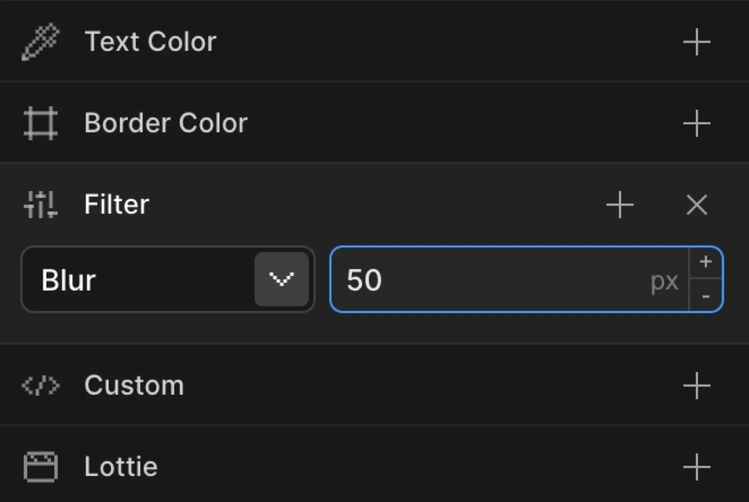
Enable filters
Click the toggle next to Filter to enable it. A filter row appears with a type dropdown and a value input. Each row represents one CSS filter function. You can stack multiple filters by clicking the + button next to the filter header.
Filter types
Select the filter function from the dropdown at the left of each row. The value input to the right updates its unit automatically based on the type.
Custom
Accepts a raw CSS filter string. Use this when you need a function not listed in the dropdown, or when you want to combine multiple functions in a single value (e.g., blur(4px) brightness(120%)).
The value input becomes a free-text field — type any valid CSS filter expression.
Blur
Applies a Gaussian blur. The value is in pixels (px). Higher values produce a stronger blur.
| Range | Unit | Notes |
|---|---|---|
0 – ∞ | px | 0 = sharp (no blur); 10 = heavily blurred |
Brightness
Adjusts the luminance of the element. The value is a percentage (%).
| Range | Unit | Notes |
|---|---|---|
0 – ∞ | % | 100% = natural brightness; 0% = completely black; 150% = boosted |
Contrast
Adjusts the difference between light and dark areas. The value is a percentage (%).
| Range | Unit | Notes |
|---|---|---|
0 – ∞ | % | 100% = natural contrast; 0% = flat gray; 200% = high contrast |
Grayscale
Converts the element to grayscale. The value is a percentage (%).
| Range | Unit | Notes |
|---|---|---|
0 – 100 | % | 0% = full color; 100% = fully grayscale |
Hue Rotate
Rotates the hue of all colors by a given angle. The value is in degrees (deg).
| Range | Unit | Notes |
|---|---|---|
| Any number | deg | 0 = no change; 180 = complementary colors; 360 = full rotation back to normal |
Negative values rotate in the opposite direction. There is no enforced min or max.
Invert
Inverts the colors of the element. The value is a percentage (%).
| Range | Unit | Notes |
|---|---|---|
0 – 100 | % | 0% = normal; 100% = fully inverted (negative) |
Saturate
Controls color saturation. The value is a percentage (%).
| Range | Unit | Notes |
|---|---|---|
0 – ∞ | % | 100% = natural saturation; 0% = fully desaturated; 200% = hyper-saturated |
Sepia
Applies a warm sepia tone. The value is a percentage (%).
| Range | Unit | Notes |
|---|---|---|
0 – 100 | % | 0% = no tint; 100% = full sepia tone |
Controls summary
| Control | Description |
|---|---|
| Type dropdown | Choose the filter function. Searchable. |
| Value input | Numeric value for the selected filter type. Unit is appended automatically. |
| Custom text input | Free-text field shown when type is set to Custom. Accepts any CSS filter string. |
| + button | Adds another filter row so you can stack multiple filter functions. |
From mode — blur reveal
Switch to the From tab, enable Filter, and set the type to Blur with a value of 10. The element starts blurred and animates to its natural sharp state.
This is the most common filter pattern: the element is blurry at the start and sharpens into view. Pair it with Opacity at 0 on the same From tab for a polished entrance.
To mode — grayscale on hover
Switch to the To tab, enable Filter, and set the type to Grayscale with a value of 100. The element animates from its natural color to fully grayscale.
Use To for hover effects, dimming states, or exit animations where the element should transition away from its natural appearance.
The box starts at filter: blur(12px) with opacity: 0 (the From values) and animates to sharp and fully visible — its natural CSS state.
SDK equivalent
In the SDK, filter accepts a CSS filter string directly. The builder’s filter rows are serialized into a single CSS string at output time.
Blur reveal — From mode:
import { Motion } from '@motion.page/sdk';

Motion('blur-reveal', '.hero', {
  from: { filter: 'blur(10px)', opacity: 0 },
  duration: 0.8,
  ease: 'power2.out',
}).onPageLoad();
Grayscale hover — To mode:
Motion('grayscale-hover', '.card', {
  to: { filter: 'grayscale(100%)' },
  duration: 0.3,
  ease: 'power1.out',
}).onHover({ each: true, onLeave: 'reverse' });
Brightness pulse — loop:
Motion('brightness-pulse', '.cta', {
  to: { filter: 'brightness(140%)' },
  duration: 0.6,
  ease: 'sine.inOut',
  repeat: { yoyo: true, times: -1 },
}).onPageLoad();
Custom filter string — multiple functions:
Motion('warm-reveal', '.image', {
  from: { filter: 'blur(6px) sepia(80%)', opacity: 0 },
  duration: 1,
  ease: 'power3.out',
}).onScroll();
For the full SDK reference, see Filters in the SDK.
Common patterns
Blur in on scroll
Enable Filter on the From tab, set type to Blur, value 8. Add Opacity at 0 on the same tab. Set the trigger to Scroll. Elements focus into view as they enter the viewport.
Motion('scroll-blur-in', '.section', {
  from: { filter: 'blur(8px)', opacity: 0 },
  duration: 0.7,
  ease: 'power2.out',
}).onScroll();
Grayscale on hover
Enable Filter on the To tab, set type to Grayscale, value 100. Set the trigger to Hover with Reverse on leave enabled. Images desaturate on hover and return to full color on mouse out.
Motion('hover-grayscale', '.thumbnail', {
  to: { filter: 'grayscale(100%)' },
  duration: 0.35,
  ease: 'power1.out',
}).onHover({ each: true, onLeave: 'reverse' });
Brightness pulse
Enable Filter on the To tab, set type to Brightness, value 150. Set the trigger to Page Load. Enable Repeat with Yoyo on and Times set to -1. A call-to-action element glows with a repeating brightness cycle.
Motion('brightness-pulse', '.badge', {
  to: { filter: 'brightness(150%)' },
  duration: 0.8,
  ease: 'sine.inOut',
  repeat: { yoyo: true, times: -1 },
}).onPageLoad();
Blur out on exit
Set the trigger to Page Exit. Enable Filter on the To tab, set type to Blur, value 10. Pair with Opacity at 0. The page blurs and fades out when the user navigates away.
Motion('page-exit', 'body', {
  to: { filter: 'blur(10px)', opacity: 0 },
  duration: 0.5,
  ease: 'power2.in',
}).onPageExit();
Hue rotate on scroll (scrub)
Enable Filter on the To tab, set type to Hue Rotate, value 180. Set the trigger to Scroll with Scrub enabled. The element shifts through complementary colors as the user scrolls.
Motion('hue-scroll', '.hero-bg', {
  to: { filter: 'hue-rotate(180deg)' },
}).onScroll({ scrub: true });
Related
- From, To & Set — How the three animation modes work and when to use each
- Filters in the SDK — SDK reference for the
filterproperty - Opacity — Combine with Filter for polished blur-in entrances
- Custom Properties — Animate arbitrary CSS variables alongside filters