Page Load Trigger
Configure auto-play on DOM ready or full page load.
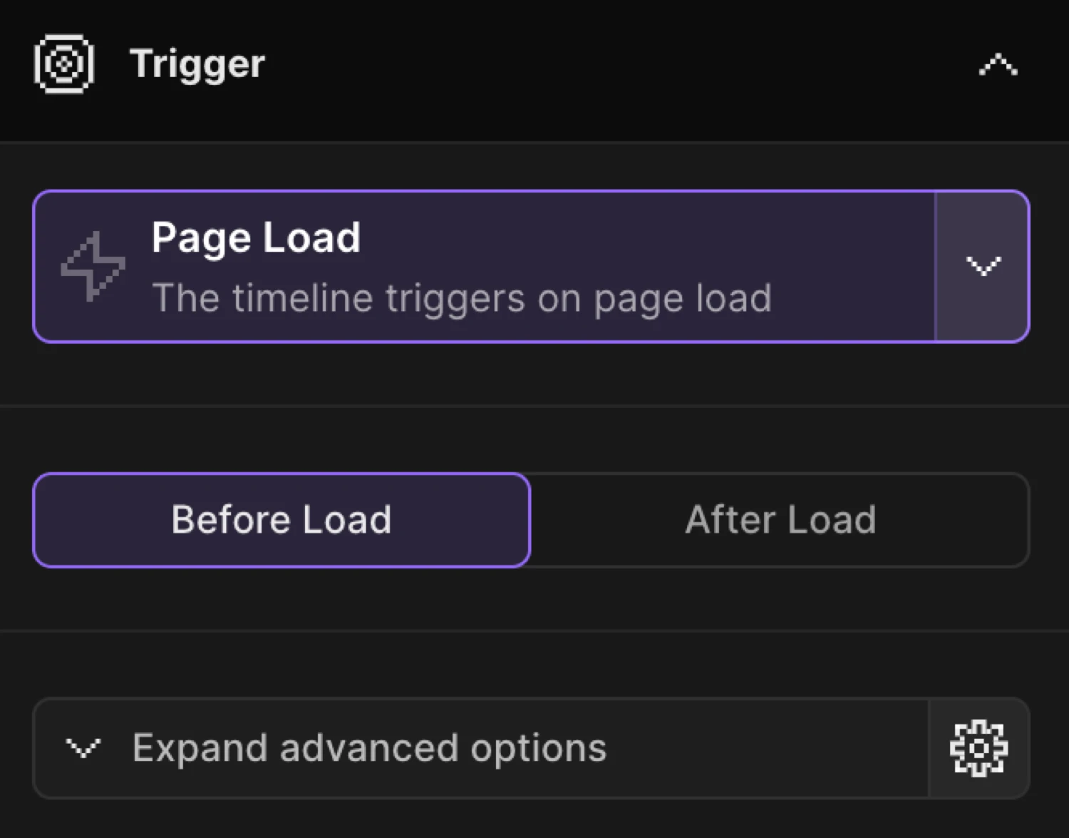
Page Load is the default trigger for every new timeline. The animation plays automatically when the page loads — no user interaction required.
Location
Left Panel → Trigger tab → Page Load
Open the Trigger tab in the Left Panel and select Page Load from the trigger dropdown. It is selected by default on new timelines.
Timing toggle
Once Page Load is selected, a two-option toggle appears below the trigger selector:
| Option | Browser event | Description |
|---|---|---|
| Before Load (default) | DOMContentLoaded | Fires as soon as the JS is loaded — before images and stylesheets finish downloading. Use for above-the-fold entrances. |
| After Load | window.load | Fires after the entire page — images, fonts, and all resources — has loaded. Use when animations depend on fully rendered assets. |
Before Load is the right choice for most entrance animations. Switch to After Load only when elements (images, web fonts, videos) need to be fully rendered before the animation begins.
Advanced options
Expand Advanced options in the Left Panel for two additional controls specific to Page Load:
Load the timeline paused
Builds the timeline on page load but does not auto-play it. Use this to trigger the animation from custom code — for example, after a user action or an asynchronous event.
When enabled, the builder displays the exact call to start the animation:
Motion('your-timeline-name').play();Play the timeline in a loop
Repeats the timeline after it finishes. Configure repeat count, delay between repeats, and YoYo mode (alternating direction) in the expanded repeat settings.
The card enters from below and fades in on page load. The icon and text lines stagger in after the container settles.
SDK equivalent
The builder’s Page Load trigger maps directly to .onPageLoad() in the SDK.
Before Load (default) — DOM ready:
import { Motion } from '@motion.page/sdk';

Motion('hero', '.hero', {
  from: { opacity: 0, y: 30 },
  duration: 0.7,
  ease: 'power2.out',
}).onPageLoad();
After Load — full page loaded:
Motion('hero', '.hero', {
  from: { opacity: 0, y: 30 },
  duration: 0.7,
  ease: 'power2.out',
}).onPageLoad({ timing: 'after' });
Paused — manual trigger:
// Timeline is built on page load but doesn't play until you call .play()
Motion('hero', '.hero', {
  from: { opacity: 0, y: 30 },
  duration: 0.7,
  ease: 'power2.out',
}).onPageLoad({ paused: true });

// Start it manually — e.g. after a custom event
Motion('hero').play();
onPageLoad options
| Option | Type | Default | Description |
|---|---|---|---|
timing | 'during' | 'after' | 'during' | 'during' fires on DOMContentLoaded (Before Load); 'after' fires on window.load (After Load). |
paused | boolean | false | When true, registers the timeline but does not auto-play. Call Motion('name').play() to start it. |
For the full SDK reference, see Page Load in the SDK.
Common patterns
Staggered card entrance
Use Page Load with a stagger to reveal a list of cards one after another as the page loads.
Motion('cards', '.card', {
  from: { opacity: 0, y: 40 },
  duration: 0.6,
  ease: 'power2.out',
  stagger: 0.1,
}).onPageLoad();
Hero reveal after images load
Images inside .hero must be fully rendered before the animation reads their dimensions. Use After Load.
Motion('hero-reveal', '.hero', {
  from: { opacity: 0, scale: 0.96 },
  duration: 0.8,
  ease: 'power3.out',
}).onPageLoad({ timing: 'after' });
Deferred banner — play on demand
Set Load the timeline paused in Advanced options, then trigger the banner after an async operation resolves.
Motion('promo-banner', '.banner', {
  from: { opacity: 0, y: -20 },
  duration: 0.5,
  ease: 'power2.out',
}).onPageLoad({ paused: true });

// Play once your condition is met
fetchUserData().then(() => {
  Motion('promo-banner').play();
});
Related
- Page Load in the SDK — Full SDK reference for
.onPageLoad()and its options - Page Exit Trigger — Intercept link clicks and play an exit animation before navigating
- From, To & Set — How animation modes work and when to use each
- Opacity — Fade in elements using the opacity property
- Translate — Slide elements in using X and Y offsets