Dimensions
Animate width and height of elements in the builder.
Dimensions animates the width and/or height of an element — from a fixed value to auto, between two explicit sizes, or expanding from zero. Use it to build expand/collapse reveals, content drawers, and size-based entrance effects.
Where to find it
Left Panel → Animation tab → Dimensions
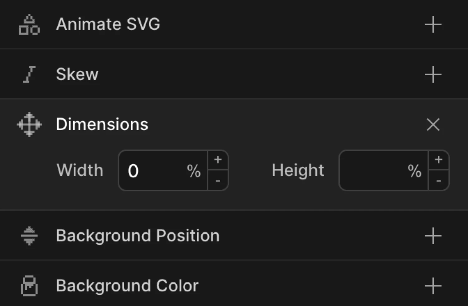
Enable the Dimensions toggle to expand the controls. The section shows two numeric inputs — Width and Height — each paired with its own unit selector.
Controls
| Control | Description |
|---|---|
| Width | Target width of the element. Leave empty to leave width unchanged. |
| Height | Target height of the element. Leave empty to leave height unchanged. |
| Unit selector | Click the unit label next to each input to cycle through available units. |
Each input has its own independent unit selector. Clicking the unit label cycles through the available options:
| Unit | Description |
|---|---|
px | Absolute pixels |
% | Percentage of the parent element’s dimension |
em | Relative to the element’s font size |
rem | Relative to the root font size |
vw | Percentage of viewport width |
vh | Percentage of viewport height |
vmin | Percentage of the smaller viewport dimension |
vmax | Percentage of the larger viewport dimension |
auto | Natural content size — browser resolves the dimension at runtime |
You can animate Width only, Height only, or both at once. Leave an input empty to keep that dimension unchanged.
From mode
In From mode, the values you set are the starting dimensions. The element animates from those sizes toward its natural CSS width and height.
Set Width to 0 in From to make an element grow in from nothing horizontally. Combine Width and Height both at 0 for a corner-expand reveal.
To mode
In To mode, the values you set are the ending dimensions. The element animates from its natural CSS size to the values you specify.
Set Height to 0 in To for a collapse-out exit. Set Width to auto in To to let an element expand to its full content width from a fixed starting size — useful for drawers and accordions.
The box starts at 60 × 60 px (the From values) and expands to 220 × 120 px — its natural CSS size.
SDK equivalent
The width and height properties map directly to the SDK’s from and to objects.
Expand from zero (From mode):
import { Motion } from '@motion.page/sdk';

Motion('expand', '.panel', {
  from: { width: 0, height: 0 },
  to: { width: 300, height: 200 },
  duration: 0.8,
  ease: 'power2.out',
}).onPageLoad();
Collapse to zero (To mode):
Motion('collapse', '.drawer', {
  to: { height: 0 },
  duration: 0.5,
  ease: 'power2.in',
}).onClick({ selector: '.close-btn' });
Animate to auto — natural content height:
// Expand an accordion panel to its full content height
Motion('accordion-open', '.panel', {
  from: { height: 0 },
  to:   { height: 'auto' },
  duration: 0.4,
  ease: 'power2.out',
}).onClick({ selector: '.accordion-trigger' });
For the full SDK reference, see Dimensions in the SDK.
Common patterns
Grow in from zero
Enable Dimensions on the From tab, set both Width and Height to 0. The element expands from a single point to its natural size.
Motion('grow-in', '.card', {
  from: { width: 0, height: 0 },
  duration: 0.6,
  ease: 'power2.out',
}).onPageLoad();
Horizontal wipe reveal
Set Width to 0 in From only. The element grows in from left to right, revealing its content. Combine with overflow: hidden on the element.
Motion('wipe-right', '.banner', {
  from: { width: 0 },
  duration: 0.7,
  ease: 'power3.out',
}).onScroll();
Collapse on exit
Set the trigger to Click. Enable Height on the To tab and set it to 0. The element collapses vertically when the trigger fires.
Motion('dismiss', '.notification', {
  to: { height: 0 },
  duration: 0.35,
  ease: 'power2.in',
}).onClick({ selector: '.dismiss-btn' });
Expand to auto height
Animate from a fixed height to auto to let an element grow to fit its full content — the ideal pattern for accordions and expandable sections.
Motion('accordion', '.panel', {
  from: { height: 0 },
  to:   { height: 'auto' },
  duration: 0.4,
  ease: 'power2.out',
}).onClick({ selector: '.trigger', each: true });
Tips
- Width and height cause layout reflow — animating these properties forces the browser to recalculate surrounding layout on every frame. For purely visual size changes (where document flow is not involved), prefer Scale, which runs entirely on the GPU without triggering layout.
autois supported as a target value — animate from a fixed value toautofor natural content sizing. This is the standard approach for accordion and drawer patterns.- Use
overflow: hiddenon the animated element (or a wrapper) when collapsing to0, otherwise content will overflow during the animation. - Double-click an input to clear the value and disable that dimension.
- Dimensions can be combined with Opacity for a fade-and-expand entrance:
from: { opacity: 0, width: 0 }.
Related
- From, To & Set — How the three animation modes work and when to use each
- Dimensions in the SDK — SDK reference for
widthandheightproperties - Scale — GPU-accelerated size change — prefer over Dimensions when layout impact is not needed
- Translate — Move elements on X and Y axes
- Opacity — Fade in/out, often combined with Dimensions
- Ease — Control the motion curve