Rotation
Rotate elements on X, Y, and Z axes with the builder rotation controls.
Rotation rotates an element by a given angle in degrees. Positive values spin clockwise; negative values spin counter-clockwise. The builder exposes a Both Axis mode (a single dial that rotates on both axes simultaneously) and a per-axis mode with Rotate X and Rotate Y inputs — so you can build anything from simple spin entrances to full perspective flips.
Where to find it
Left Panel → Animation tab → Rotation
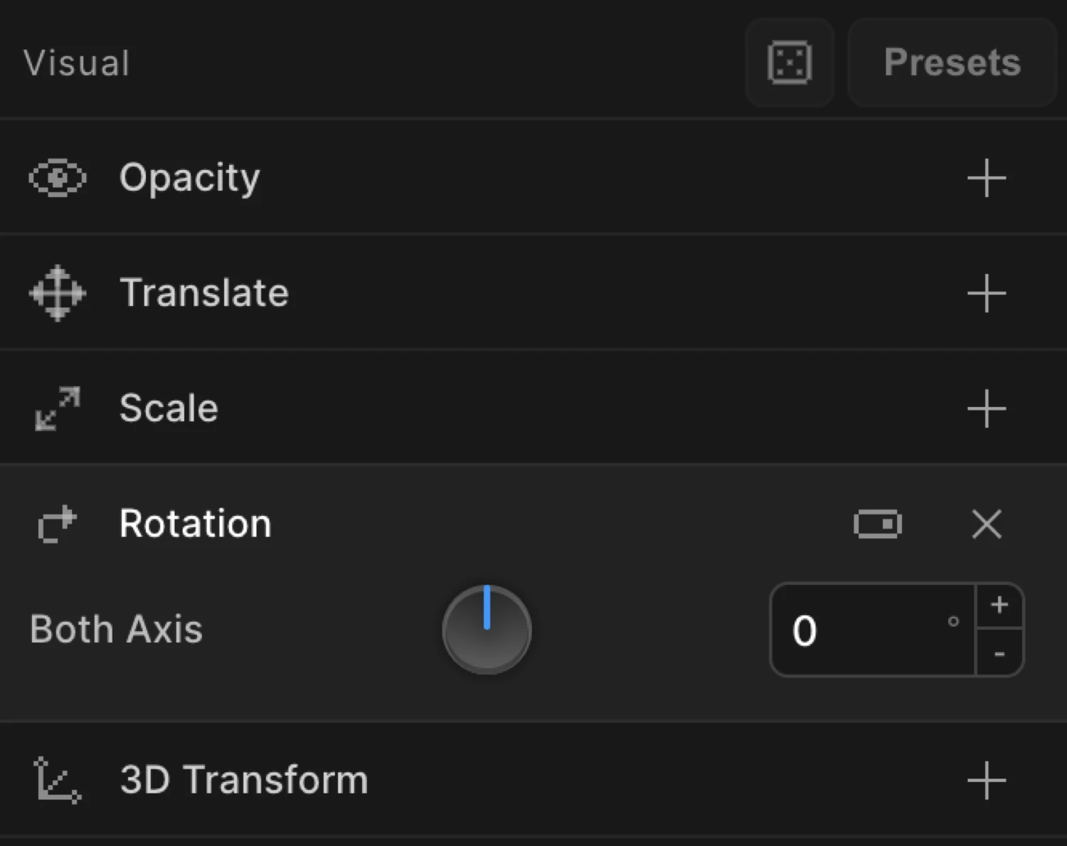
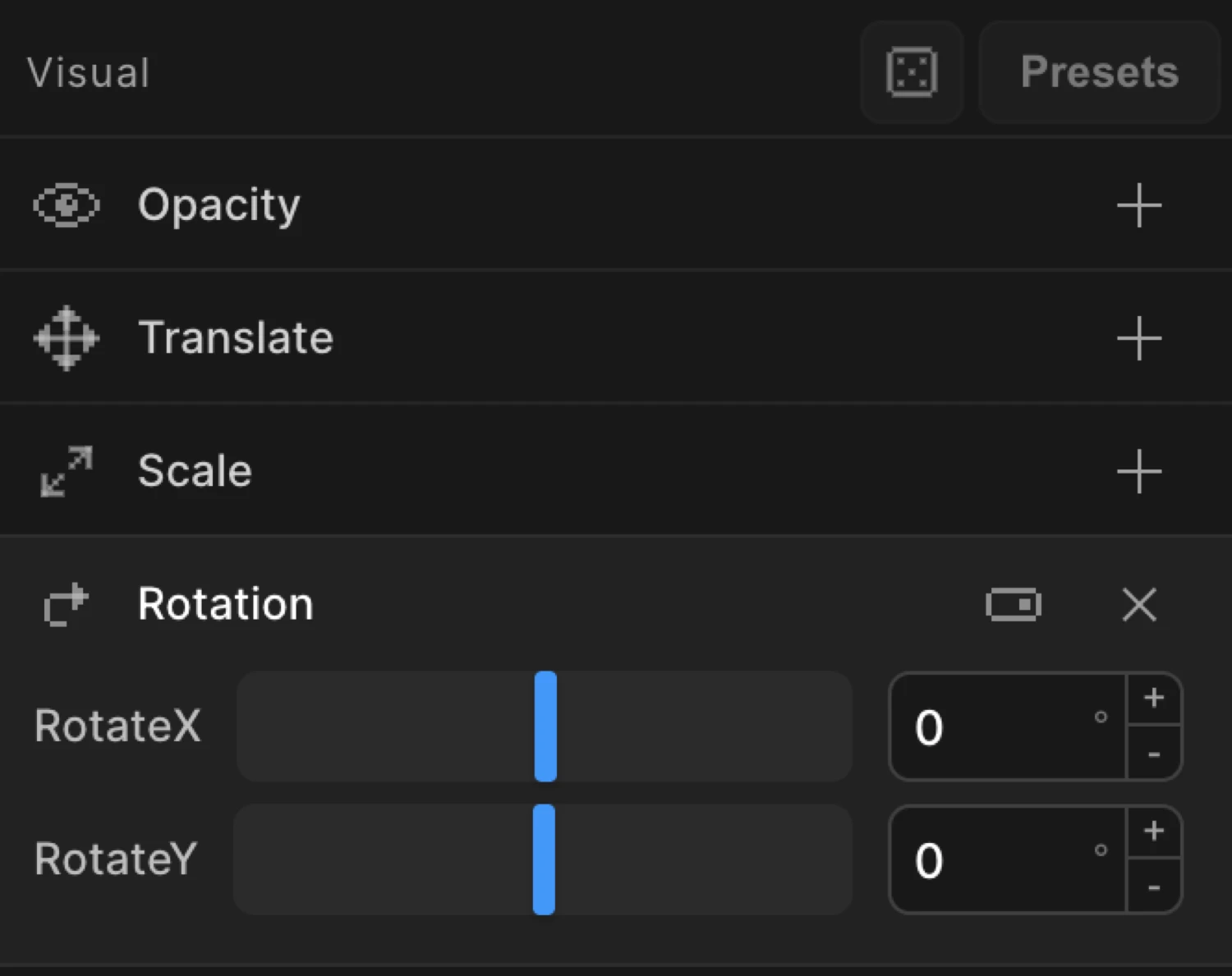
Enable the Rotation toggle to expand the controls. By default a Both Axis dial appears — drag it to rotate on both axes at once. Switch to per-axis mode to reveal separate Rotate X and Rotate Y inputs.
Controls
| Control | Description |
|---|---|
| Both Axis | A single dial that rotates the element on both axes simultaneously. Drag to set the angle. |
| Rotate X | Per-axis input — tilt forward/backward around the horizontal X-axis. Available in per-axis mode. |
| Rotate Y | Per-axis input — spin left/right around the vertical Y-axis. Available in per-axis mode. |
All inputs accept any angle in degrees. There is no enforced range — values beyond 360 or below -360 produce multi-revolution animations. Type directly into the input for precise or fractional values.
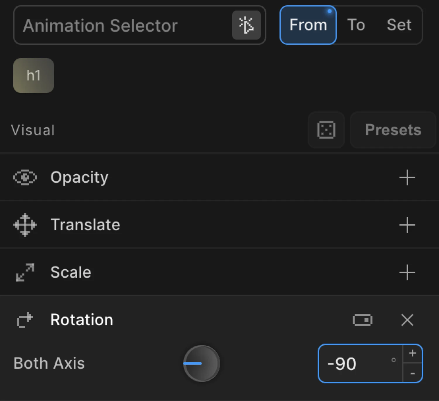
From mode — spin in
In From mode the values you set are the starting angle. The element animates from that rotation toward its natural CSS rotation (typically 0°).
Set rotation to -90 in From to make an element appear to rotate up into place from a 90° tilt. Set rotationY to 90 for a perspective flip-in — the card starts edge-on and swings open.
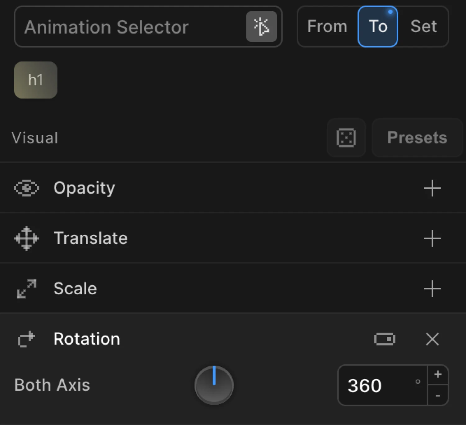
To mode — spin out and continuous effects
In To mode the values you set are the ending angle. The element animates from its natural CSS rotation to the value you specify.
Set rotation to 360 in To for a full spin on click. Set rotationY to 180 for a card-flip reveal. Use Repeat with Yoyo disabled for a continuous spin loop.
The box uses from: { rotation: -180, scale: 0.6, opacity: 0 } — it starts half-size, transparent, and rotated 180° counter-clockwise, then animates to its natural state.
SDK equivalent
The rotation, rotationX, and rotationY properties map directly to the SDK config. All values are in degrees.
Spin in on page load (From mode):
import { Motion } from '@motion.page/sdk';

Motion('spin-in', '.icon', {
  from: { rotation: -180, opacity: 0 },
  duration: 0.7,
  ease: 'power3.out',
}).onPageLoad();
Full clockwise spin on click (To mode):
Motion('spin', '.logo', {
  to: { rotation: 360 },
  duration: 0.8,
  ease: 'power2.out',
}).onClick({ each: true });
3D flip-in entrance — rotationY:
Motion('flip-in', '.card', {
  from: { rotationY: 90, opacity: 0 },
  duration: 0.6,
  ease: 'power2.out',
}).onPageLoad();
Continuous spin loop:
Motion('spinner', '.loader', {
  to: { rotation: 360 },
  duration: 1.2,
  ease: 'none',
  repeat: { times: -1 },
}).onPageLoad();
Tilt in from above — rotationX:
Motion('tilt-in', '.banner', {
  from: { rotationX: -60, opacity: 0 },
  duration: 0.65,
  ease: 'power3.out',
}).onScroll();
For the full SDK reference, see Rotation in the SDK.
Common patterns
Tilt-up entrance
from: { rotation: -15, opacity: 0 } // element tips up into place from a slight tiltClockwise spin entrance
from: { rotation: 360 } // element spins one full revolution into its resting angleCard flip on hover
to: { rotationY: 180 } // pair with Hover trigger + Reverse on leave to flip backContinuous loader spin
to: { rotation: 360 },
// set Repeat → Times to -1 and Ease to Linear for a steady loop
Staggered icon spin-in
Enable Stagger alongside Rotation in From mode. Each icon in a row rotates into place in sequence rather than all at once.
Combined entrance — rotate, scale, and fade
Motion('hero-reveal', '.hero-icon', {
  from: { rotation: -90, scale: 0.5, opacity: 0 },
  duration: 0.75,
  ease: 'back.out(1.4)',
}).onPageLoad();
Tips
- Positive = clockwise, negative = counter-clockwise — this matches CSS
rotate()convention. - Values beyond
±360produce multi-revolution animations.rotation: 720spins two full turns. rotationXandrotationYrequire a perspective context on a parent element to look three-dimensional. Without it the 3D rotation appears flat (identical to a 2D scale). Addperspective: 800pxto the parent via CSS or usetransformPerspectivein your SDK code.- The rotation pivot defaults to the element’s center. To rotate from a corner or edge, change the Transform Origin.
- For a continuous spin loop, set Ease to
Linearand Repeat → Times to-1. Any other ease will accelerate and decelerate each revolution, creating a stuttering effect. - Combine
rotationwith Scale and Opacity for richer entrances:from: { rotation: -90, scale: 0.7, opacity: 0 }. - Double-click a numeric input to clear the value.
Related
- From, To & Set — How the three animation modes work and when to use each
- Rotation in the SDK — SDK reference for
rotation,rotationX, androtationY - Translate — Move elements on X and Y axes
- Scale — Grow or shrink elements
- Transform Origin — Change the pivot point for rotation
- 3D Transforms — Perspective and 3D context for
rotationX/rotationY - Ease — Control the motion curve; elastic and back eases complement rotation well