Presentation Mode
Configure full-page section scrolling with smooth transitions, direction control, and visual effects.
Presentation Mode turns your page sections into a full-screen slide deck, where gesture events — wheel, touch, or pointer — snap the viewport between sections with smooth animated transitions.
Location
Left Panel → Trigger tab → trigger type dropdown → Observer → Presentation Mode toggle
Enable the Observer trigger first, then toggle Presentation Mode on to reveal all presentation-specific controls below it.
How it works
Each element matched by the target selector becomes a full-screen section. When the user scrolls, swipes, or drags, the viewport snaps to the next or previous section. The transition plays out over the configured duration, and a cooldown window prevents accidental double-triggers on sensitive trackpads.
Enable full-page section scrolling like a presentation. Each target becomes a full-screen section with smooth transitions between them. Callbacks are handled automatically.
Callbacks — onEnter, onLeave, onEnterBack, onLeaveBack — are wired up automatically. You do not need to configure Toggle Actions separately.
Settings
| Setting | Default | Description |
|---|---|---|
| Presentation Mode toggle | off | Activates full-screen section snapping. All controls below are hidden when this is off. |
| Infinite Repeat | off | When the last section is reached, loop back to the first (and vice versa). |
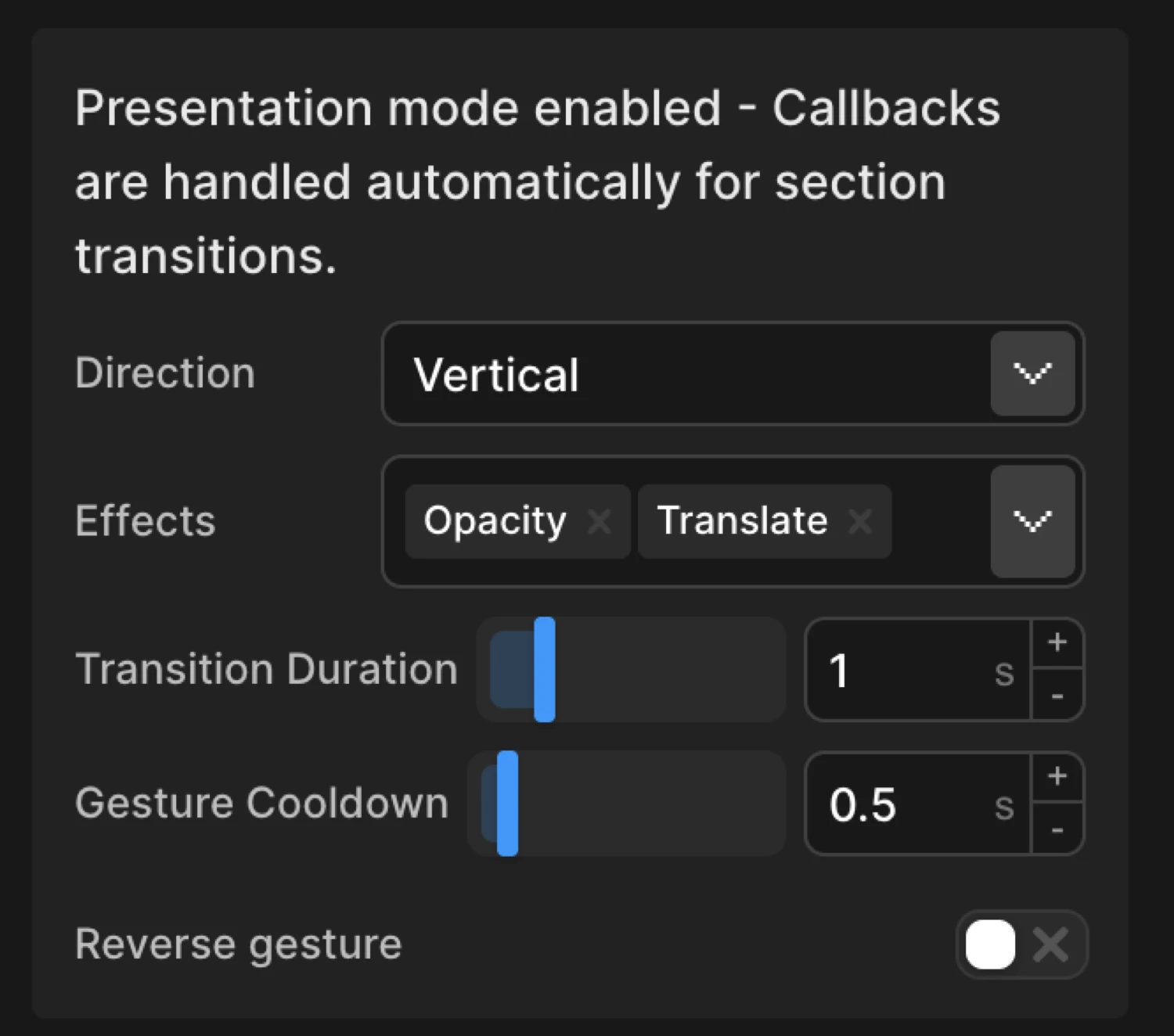
| Direction | vertical | Whether sections transition vertically (up/down) or horizontally (left/right). |
| Duration | 0.8 s | How long each section transition takes in seconds. |
| Cooldown | 0.5 s | Minimum time between section transitions. Prevents rapid triggering on sensitive trackpads. |
| Effects | (none) | Visual effects applied during transitions — fade, slide, or both. |
| Reverse Gesture | off | Swap gesture directions: up/left navigates forward, down/right navigates backward. |
| Use Vertical Wheel | off | Allow vertical mouse wheel to navigate horizontal sections. Useful for desktop users with traditional mice. |
Effects
Choose which visual effects to apply during section transitions. Select both for smooth fade and slide animations.
| Effect | Behaviour |
|---|---|
| Fade | The outgoing section fades out while the incoming section fades in over the transition duration. |
| Slide | Sections physically translate in the configured direction — the outgoing section slides out while the incoming one slides in. |
| Both | Fade and slide run simultaneously, producing a smooth cinematic transition. |
| (none selected) | An instant cut with no visual transition effect — only the snap itself is animated. |
Selecting both effects is the recommended starting point for most presentation layouts.
Direction
Choose whether sections transition vertically (up/down) or horizontally (left/right).
| Value | Behaviour |
|---|---|
vertical | Users scroll down to advance and up to go back. Works naturally with all scroll input devices. |
horizontal | Users swipe left/right or use arrow keys to advance. Combine with Use Vertical Wheel for desktop compatibility. |
Use Vertical Wheel
Enable vertical mouse wheel scrolling to navigate horizontal sections. Useful for desktop users with traditional mice.
When Direction is set to horizontal, desktop users without a trackpad cannot naturally swipe left/right with a standard scroll wheel. Enable Use Vertical Wheel to map vertical wheel events to horizontal section navigation so all input devices work consistently.
Reverse Gesture
Use standard gesture directions. When enabled, up/left gestures navigate forward, down/right navigate backward.
Disabled by default: down/right advances to the next section. Enable Reverse Gesture to flip this — up/left advances, down/right goes back. Use this when your layout reads right-to-left or your art direction calls for inverted navigation.
In the builder this demo corresponds to a From animation with opacity: 0 and y: 60 on each .slide, with Presentation Mode enabled, Direction set to vertical, and Effects set to both fade and slide.
SDK equivalent
The builder Presentation Mode maps to the presentation option inside .observer() in the SDK.
import { Motion } from "@motion.page/sdk";

Motion("slides", ".section", {
  to: { opacity: 1 },
}).observer({
  presentation: true,
  direction: "vertical",
  duration: 0.8,
  cooldown: 0.5,
  effects: ["fade", "slide"],
});
Horizontal with vertical wheel support:
Motion("portfolio", ".panel", {
  to: { opacity: 1 },
}).observer({
  presentation: true,
  direction: "horizontal",
  duration: 0.6,
  cooldown: 0.4,
  effects: ["fade", "slide"],
  useVerticalWheel: true,
});
Looping showcase:
Motion("showcase", ".product-slide", {
  to: { opacity: 1 },
}).observer({
  presentation: true,
  direction: "vertical",
  duration: 1,
  cooldown: 0.6,
  infiniteRepeat: true,
  effects: ["slide"],
});
For the full SDK reference see Presentation Mode.
Common patterns
Vertical storytelling
Set Direction to vertical, enable both Effects (fade + slide), and set Duration to 0.8–1s. Each section becomes a narrative beat — users scroll down through the story at a deliberate pace. Pair with a long-form hero section at the top for a strong landing page.
Horizontal portfolio
Set Direction to horizontal and enable Use Vertical Wheel so desktop users with traditional mice can navigate. Each panel can showcase a project or case study. Use Reverse Gesture if the design reads right-to-left.
Looping product showcase
Enable Infinite Repeat with a short Duration (0.5s) and minimal Cooldown (0.3s) for a fast, kiosk-style loop. Works well for trade-show displays or auto-advancing hero sections combined with a timed setInterval callback.
Related
- Observer Gesture — The parent trigger that Presentation Mode extends
- Scroll Trigger — Standard scroll-based animation without section snapping
- Presentation Mode — SDK reference —
observer({ presentation: true })API and all options - Left Panel — Full Left Panel reference including the Trigger tab