Background Color
Animate background colors between any two values in the builder.
Background Color animates the background-color CSS property of an element — transitioning from one color to another over the course of the animation. Use it to drive hover color changes, scroll-triggered palette shifts, or full-section background transitions.
Location
Left Panel → Animation tab → Visual Properties → Background Color
Enable Background Color
Click the toggle next to Background Color to enable it. The row expands to reveal the color input.
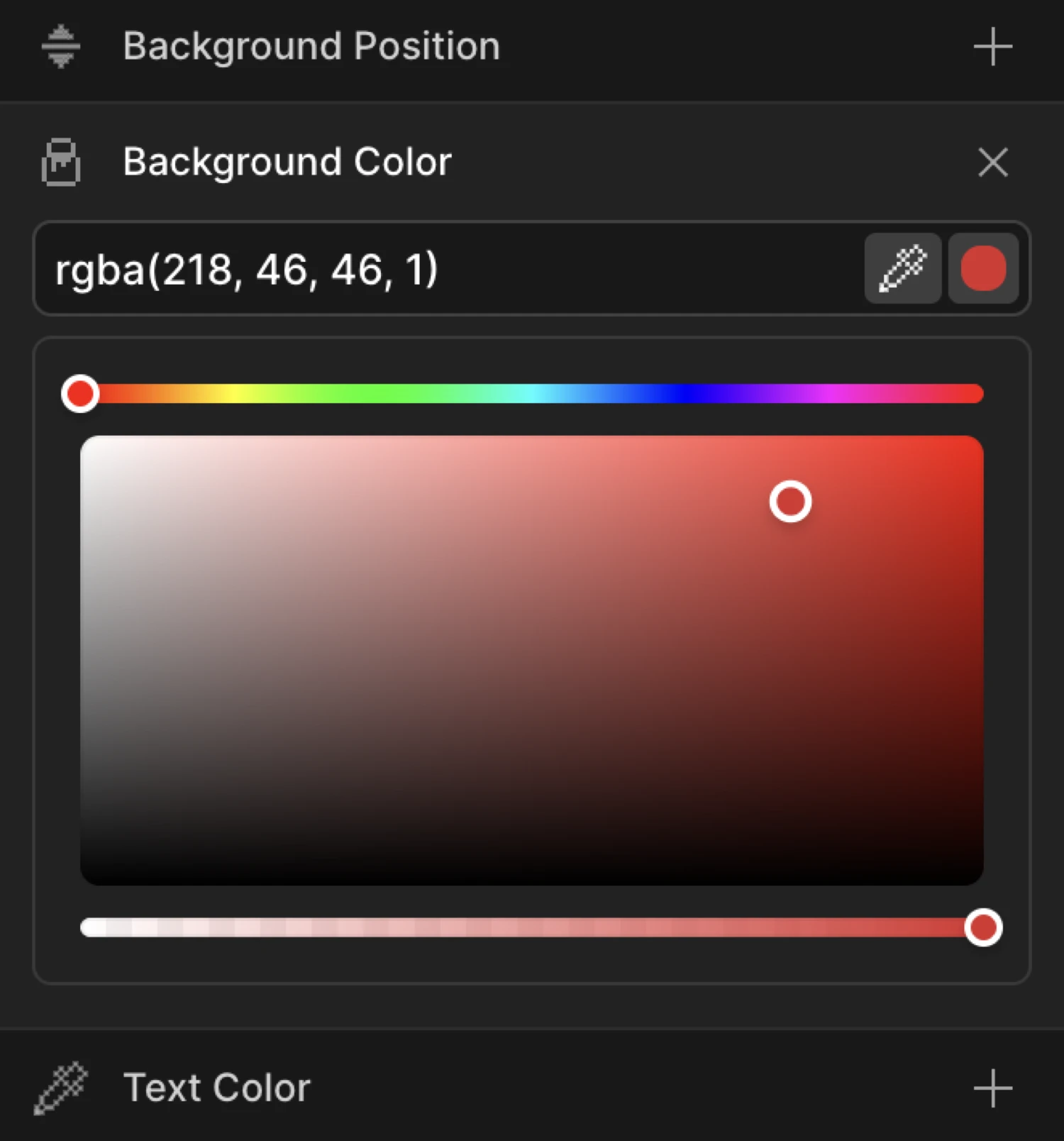
Controls
The expanded row contains three controls:
| Control | Description |
|---|---|
| Text input | Type any valid CSS color: hex (#6633EE), RGB (rgb(102, 51, 238)), RGBA (rgba(102, 51, 238, 0.5)), or a CSS variable (var(--brand-color)). |
| Color swatch | Click the colored square to open the visual color picker. The picker supports full RGBA — drag the hue bar at the top, pick saturation and brightness in the canvas below, and adjust the alpha slider at the bottom for transparency. |
| Eye dropper | Click the pipette icon to sample any color from your screen. Only available in browsers that support the EyeDropper API (Chrome/Edge). |
RGBA values with transparency are fully supported — The SDK interpolates both the color channels and the alpha channel during the animation.
From mode — element enters with a color
Switch to the From tab, enable Background Color, and pick a starting color. The element begins at that color and transitions to whatever background-color is defined in your CSS.
This is useful for reveal animations where an element “washes in” from a highlight color — for example, starting with a bright yellow flash and settling into the element’s natural white or transparent background.
To mode — element transitions to a color
Switch to the To tab, enable Background Color, and pick a target color. The element starts at its natural CSS background-color and animates to the value you set.
To mode is the right choice for:
- Hover color changes (element lights up on hover, reverts on leave)
- Scroll-driven section color shifts
- Click-triggered state changes
The box starts at its CSS background-color (dark navy) and animates to the To color (#6633EE) — a smooth one-second transition using a custom ease.
SDK equivalent
The backgroundColor property maps directly to the SDK’s from and to objects.
Color wash-in (From mode):
import { Motion } from '@motion.page/sdk';

Motion('color-wash', '.hero', {
  from: { backgroundColor: '#ffdd57' },
  duration: 0.9,
  ease: 'power2.out',
}).onPageLoad();
Hover color change (To mode):
Motion('hover-color', '.card', {
  to: { backgroundColor: '#6633EE' },
  duration: 0.3,
  ease: 'power2.out',
}).onHover({ each: true, onLeave: 'reverse' });
Scroll-driven palette shift — From and To both set:
// Transition from one explicit color to another as the section scrolls in
Motion('section-shift', '.hero', {
  from: { backgroundColor: '#0f0f1a' },
  to:   { backgroundColor: '#6633EE' },
  duration: 1,
  ease: 'none',
}).onScroll({ scrub: true });
See Colors in the SDK for the full color animation reference.
Common patterns
Hover color change
Enable Background Color on the To tab and pick your hover color. Set the trigger to Hover with Reverse on leave enabled. The element shifts color on hover and snaps back on mouse out.
Motion('hover-bg', '.button', {
  to: { backgroundColor: '#4f23cc' },
  duration: 0.25,
  ease: 'power1.out',
}).onHover({ each: true, onLeave: 'reverse' });
Scroll-triggered color shift
Enable Background Color on the To tab and enable the Scroll trigger with Scrub on. The background color of a section changes in direct proportion to the scroll position — no timeline, just a live color map.
Motion('scroll-color', '.section', {
  to: { backgroundColor: '#6633EE' },
  duration: 1,
  ease: 'none',
}).onScroll({ scrub: true });
Section color transitions
Use Background Color on the From tab to give each section a unique entry color that resolves to the page’s base color. Stack animations for consecutive sections to create a flowing palette as the user scrolls through.
Motion('section-reveal', '.section', {
  from: { backgroundColor: '#ffdd57', opacity: 0 },
  duration: 0.7,
  ease: 'power2.out',
}).onScroll();
Flash highlight on page load
Set trigger to Page Load, enable Background Color on the From tab with a bright accent color, and pair it with a short duration. The element flashes from the accent into its natural background — a subtle “look here” signal.
Motion('flash-load', '.cta-button', {
  from: { backgroundColor: '#ffdd57' },
  duration: 0.5,
  ease: 'power3.out',
}).onPageLoad();
Tips
- RGBA transparency is fully animated — if you set a semi-transparent color like
rgba(102, 51, 238, 0), the SDK will smoothly interpolate both the RGB channels and the alpha value. - CSS variables work in the input — type
var(--brand-color)to reference a design token. The SDK resolves the computed value at runtime. - The natural CSS value is the other endpoint — in From mode the element lands on its CSS background; in To mode it departs from its CSS background. You only need to define one color per mode.
- Pair with Opacity for richer entrances — a color wash combined with a fade-in feels more designed than either property alone.
- Avoid animating
backgroundshorthand — always usebackground-color(thebackgroundColorSDK property) rather than thebackgroundshorthand, which cannot be interpolated reliably when it contains gradients or images.
Related
- Text Color — Animate the
color(font color) property - Border Color — Animate the border color
- Opacity — Animate transparency; pairs well with Background Color
- Colors in the SDK — Full SDK reference for color animation
- From, To & Set — How the three animation modes work and when to use each