Hover Trigger
Configure hover animations with single and multi-target modes, and control what happens on mouse leave.
The Hover trigger plays a timeline when the pointer enters a target element. Configure a separate trigger selector, animate each matched element independently, and control exactly what happens when the pointer leaves — reverse, restart, pause, or stop.
Location
Left Panel → Trigger tab → Interactions → Hover
Select Hover from the trigger dropdown to reveal the hover configuration panel.
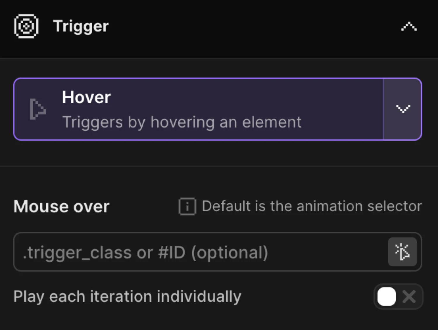
Mouse Over
The Mouse Over section defines which element triggers the animation on pointer enter.
| Control | Description |
|---|---|
| Trigger selector | CSS selector for the hover target. Leave empty to use the animation selector. Accepts .class or #id. |
| Play each iteration individually | When enabled, each matched element gets its own independent timeline instance — hovering one does not affect the others. |
Trigger selector behavior depends on the mode:
- Single mode (
eachoff) — pick any selector:.trigger_class,#ID. Leave empty to default to the animation selector. - Each mode (
eachon) — the selector acts as a wrapper class. Elements inside each wrapper are animated individually. Leave empty to use the animation selector as the wrapper.
Leave empty to use the animation selector as a hover trigger or pick a specific selector that triggers the timeline.
By enabling Play each iteration individually, you can animate each iteration of the class individually one-by-one.
Mouse Leave
The Mouse Leave section controls what the timeline does when the pointer exits the trigger element. The options are mutually exclusive — the first enabled option takes effect.
| Control | Default | Description |
|---|---|---|
| Pause animation | off | Pauses the timeline at its current position when the pointer leaves. |
| Stop animation | off | Stops the timeline and holds the current position without reversing. |
| Restart animation | off | Snaps back to the start state and replays the timeline forward. |
| Reverse animation | on | Plays the timeline backward to the start state on mouse leave. |
| Reverse animation after certain time | off | Waits a set number of seconds before reversing on mouse leave. |
When Reverse animation after certain time is enabled, a Delay input appears. Set the number of seconds to wait before the reverse begins (default: 0.5s).
Priority order — if multiple leave options are enabled, the first match wins: Pause → Stop → Restart → Reverse.
Reverse the timeline on mouse leave.
Restart the timeline on mouse leave.
Add a delay before the timeline reverse.
In the builder this is a To animation with y: -8 and scale: 1.04, with Reverse animation enabled in the Mouse Leave section.
SDK equivalent
The builder Hover trigger maps directly to .onHover() in the SDK.
import { Motion } from "@motion.page/sdk";

// Lift on hover, reverse on leave (mirrors builder defaults)
Motion("card-lift", ".card", {
  to: { y: -8, scale: 1.04, boxShadow: "0 20px 40px rgba(0,0,0,0.35)" },
  duration: 0.28,
  ease: "expo.out",
}).onHover({ onLeave: "reverse" });
Each — independent per-element instances:
// Each card in a grid lifts independently
Motion("cards", ".card", {
  to: { y: -8, scale: 1.04 },
  duration: 0.28,
  ease: "expo.out",
}).onHover({ each: true, onLeave: "reverse" });
Separate trigger selector:
// A button triggers an animation on a sibling element
Motion("panel-reveal", ".panel", {
  from: { opacity: 0, y: 12 },
  duration: 0.3,
  ease: "power2.out",
}).onHover({ target: ".panel-trigger", onLeave: "reverse" });
Reverse with delay:
Motion("tooltip", ".tooltip", {
  to: { opacity: 1, y: 0 },
  duration: 0.2,
}).onHover({ onLeave: "reverse", leaveDelay: 0.5 });
For the full SDK reference see Hover Trigger in the SDK.
Common patterns
Per-card independent hover
Enable Play each iteration individually so hovering one card in a grid does not affect the others. Leave the trigger selector empty — each card becomes its own trigger and animated target.
Delayed reverse for tooltips
Enable Reverse animation after certain time and set a short delay (e.g. 0.3s) so the tooltip stays visible briefly after the pointer leaves, preventing it from disappearing too abruptly.
Hover with a wrapper trigger
In each mode the trigger selector acts as a wrapper. Set it to .card-wrapper and your animation selector to .card-inner — hovering anywhere inside .card-wrapper triggers the animation on the corresponding .card-inner only.
Related
- Hover Trigger in the SDK — Full SDK reference for
.onHover() - Click Trigger — Trigger animations on click with toggle support
- Page Load Trigger — Auto-play animations when the page loads
- From, To & Set — Configure what the animation does