Border Color
Animate border colors between any two values in the builder.
Border Color animates the border-color CSS property of an element — transitioning between two color values over the duration of the animation. Use it to draw attention to interactive states, validation feedback, or decorative hover effects.
Location
Left Panel → Animation tab → Visual Properties → Border Color
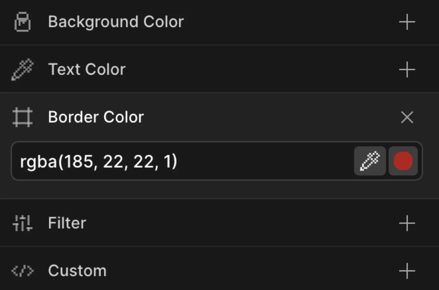
Enable Border Color
Click the toggle next to Border Color to enable it. The row expands to reveal the color picker control.
Controls
| Control | Description |
|---|---|
| Color picker | Click the swatch to open the color picker. Supports hex, RGB, HSL, and named CSS colors. Also accepts transparent. |
| Hex / color input | Type any valid CSS color value directly into the field (e.g. #FF3366, rgba(255,0,0,0.5), transparent). |
From mode
Switch to the From tab, enable Border Color, and choose a starting color. The element’s border starts at that color and transitions to whatever border-color is defined in your CSS.
Use From mode when the element already has a border in CSS and you want the color to arrive at that natural value — for example, animating from red to the default grey border on page load.
To mode
Switch to the To tab, enable Border Color, and choose a destination color. The element’s border starts at its natural CSS border-color and transitions to the color you specify.
Use To mode for hover highlights, focus rings, and validation state changes where the element has a resting border color and you want it to shift to an accent on interaction.
The box starts with a purple border (#6633EE) and transitions to a pink-red (#FF3366), then back — demonstrating a round-trip border color animation using From and To together.
SDK equivalent
The borderColor property maps directly to the from and to objects in the SDK.
Highlight on hover (To mode):
import { Motion } from '@motion.page/sdk';

Motion('border-highlight', '.card', {
  to: { borderColor: '#6633EE' },
  duration: 0.3,
  ease: 'power2.out',
}).onHover({ each: true, onLeave: 'reverse' });
Validation error state (To mode):
Motion('invalid-border', '.input', {
  to: { borderColor: '#FF3366' },
  duration: 0.25,
  ease: 'power1.out',
}).onClick({ selector: '.submit-btn' });
Entrance from a starting color (From mode):
Motion('border-arrive', '.panel', {
  from: { borderColor: 'transparent' },
  duration: 0.6,
  ease: 'power2.out',
}).onPageLoad();
See Colors in the SDK for the full color animation reference.
Common patterns
Focus / active state border highlight
Set the trigger to Focus or Click. Enable Border Color on the To tab with your brand accent color. Enable Reverse on leave so the border returns to its default when focus is lost.
Motion('focus-ring', '.form-input', {
  to: { borderColor: '#6633EE' },
  duration: 0.2,
  ease: 'power1.out',
}).onFocus({ each: true, onBlur: 'reverse' });
Card hover border
On hover, shift a card’s border from a subtle grey to a vivid color to signal interactivity. Combine with a slight Scale or Translate Y for extra polish.
Motion('card-hover-border', '.card', {
  to: { borderColor: '#00C2FF' },
  duration: 0.25,
  ease: 'power2.out',
}).onHover({ each: true, onLeave: 'reverse' });
Validation feedback color
Animate the border of a form field from its resting color to red on an error state, or to green on success. Trigger on a class toggle or button click.
// Error state
Motion('field-error', '.field', {
  to: { borderColor: '#FF3366' },
  duration: 0.2,
  ease: 'power1.out',
}).onClick({ selector: '.validate-btn' });

// Success state
Motion('field-success', '.field', {
  to: { borderColor: '#00D26A' },
  duration: 0.3,
  ease: 'power2.out',
}).onClick({ selector: '.validate-btn' });
Tips
- The element must already have a visible border. If
border-widthis0orborder-styleisnone, the color animation will not be visible. Set at leastborder: 1px solidin your CSS before animating the color. - Animating from
transparentto a color creates a clean “border appear” entrance effect. - Use
rgba()orhsla()values to animate border color alongside opacity for a fade-in border effect. - Border color animates all four sides simultaneously. To animate individual sides (e.g. only the bottom), use custom CSS alongside the SDK’s
borderBottomColorproperty instead.
Related
- Background Color — Animate the fill color of an element
- Text Color — Animate the foreground text color
- Opacity — Fade an element in or out
- Colors in the SDK — Full color animation reference for the SDK