Left Panel
Animation configuration — tabs, From/To/Set, selectors, folders, and trigger section.
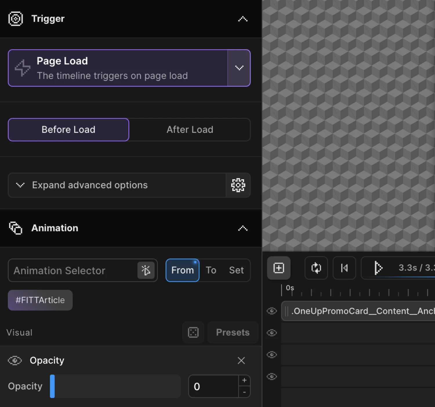
The Left Panel is the primary animation configuration area. It has two main tabs: Animation and Trigger.
Animation Tab
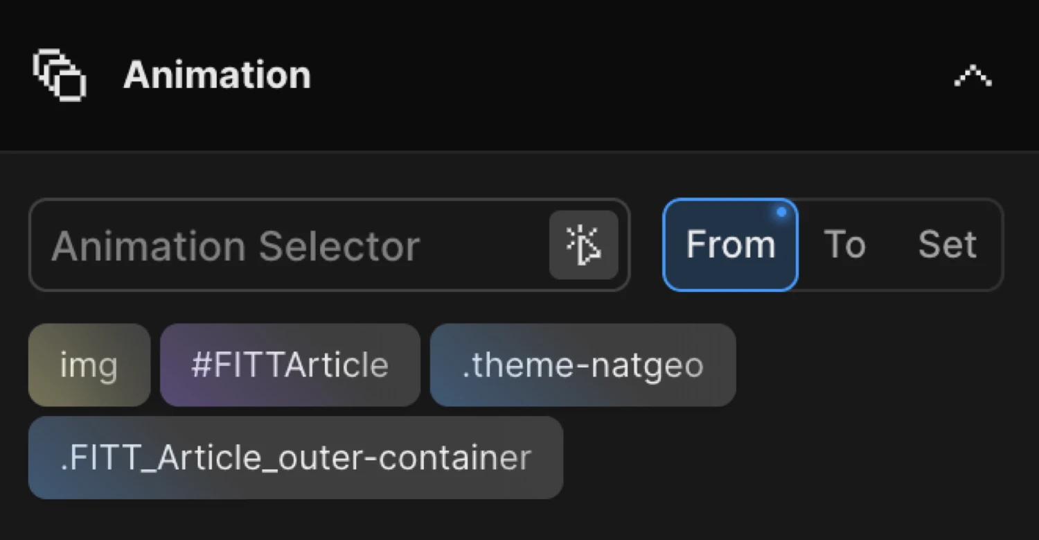
The Animation tab is where you define what gets animated and how. It is split into a selector input at the top, the From/To/Set mode toggle, and then the list of animatable properties beneath.
Selector Input
The selector input accepts any valid CSS selector — class, ID, attribute, pseudo-element, or a comma-separated list. Every element that matches the selector on the page will be targeted by the animation.
| Control | Description |
|---|---|
| Selector field | Choose one or multiple CSS selectors to animate. |
| Scanner icon | Enable the selector scanner — click any element in the Frame View to insert its selector automatically. |
Click the scanner icon (tSDetector) to activate the interactive selector detector. With it enabled, hovering over the Frame View highlights elements, and clicking inserts the matching selector into the field.
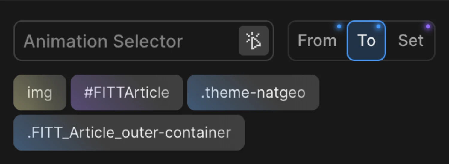
From / To / Set Mode Toggle
Just below the selector field is the From / To / Set toggle — a three-way switch that controls which endpoint of the animation you are configuring.
| Mode | Description |
|---|---|
| From | Add animation properties as ‘FROM’. They will be a starting point of your animation, while an ending point are current values of the element or ‘To’ properties. |
| To | Add animation properties as ‘TO’. They will be an ending point of your animation, while a starting point are current values of the element or ‘From’ properties. |
| Set | Add properties as ‘SET’. Acts as a zero-duration ‘TO’ tween, which immediately sets properties of the target(s) with no animation. |
A dot indicator appears on the From or To button when that mode has properties configured. Both modes can hold values simultaneously — switch between them freely to set up each endpoint.
Tip: Right-click on the From or To button to reveal additional options: Duplicate, Toggle (swap From ↔ To), Clear, Copy, and Paste.
For a full explanation of how these modes interact, see From, To & Set.
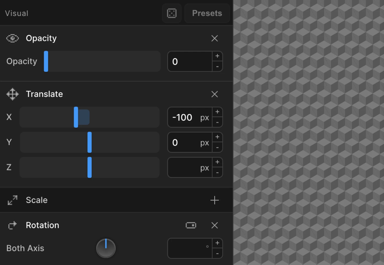
Visual Properties
Visual properties control the appearance and transform of the target element. Each property has a toggle to enable or disable it on the current node.
| Property | Description |
|---|---|
| Opacity | Fade in & out using opacity. |
| Translate | Move the element on X and/or Y axis. Characterized by a two-dimensional vector defining movement in each direction. |
| Scale | Increase or decrease size of the element. Characterized by a two-dimensional vector. If both coordinates are equal, scaling is uniform and aspect ratio is preserved. |
| Rotation | Rotate the element on both axis, or Y/X. Positive = clockwise, negative = counter-clockwise. |
| 3D Transform | Transform the element on the 3D plane using shear mapping. |
| Animate SVG | Animate SVG icons & illustrations using DrawSVG and/or changing colors of strokes and fills. |
| Skew | Transform the element on the 2D plane using shear mapping that distorts each point by a certain angle in horizontal and vertical directions. |
| Dimensions | Animate the width and/or height. |
| Background Position | Animate background position for a parallax effect. Note: Set up both positions to animate Y only. |
| Background Color | Animate the background color. |
| Text Color | Animate the font color. |
| Border Color | Animate the border color. |
| Filter | Apply CSS filters like blur, grayscale, brightness. |
| Custom | Add any animatable CSS property. Right-click to remove in column view. Switch to Advanced Code Field for any valid key/value pair. |
| Lottie | Sync Lottie animation with the timeline. Include Lottie Player script and pick the player element’s selector. |
| Image Sequence | Play a sequence of images on the trigger. |
| Transform Origin | Set the origin point of transform animation (translate, scale, rotation). |
Click the toggle next to a property name to enable it. Once enabled, the property expands to show its input fields. Disable a property to remove it from the animation without losing its values.
Functional Properties
Functional properties are direction-agnostic — they apply to the entire animation node regardless of whether you are on the From or To tab. They control behaviour like sequencing, repetition, and text splitting rather than visual end-states.
| Property | Description |
|---|---|
| Text Splitter | Split each character, word or line into its own div, and animate them one by one using Stagger. Optional class with ++ suffix for incremented numbering. |
| Text Flapper | Solari split-flap display effect that cycles through random characters before landing on target text. Choose transition type, character set, cycle count range, and perspective. |
| Fit | Morphs one element’s geometry to match another’s — animates source toward target’s position and size. |
| Stagger | Animate multiple targets in sequence by adding delay to each element. Use a common selector or multiple selectors. |
| Repeat | Repeat in a loop or any number of repetitions. Use -1 for infinite loop. |
| MotionPath | Animate and move any element along an SVG path. |
| Timeline Control | Control timeline playback behavior. |
| Ease | Set ease style of the animation. Use any default eases like Power1.easeOut. |
Trigger Tab
The Trigger tab defines what causes the animation to play. Select a trigger type from the dropdown at the top of the tab — the options beneath update dynamically to match the selected type.
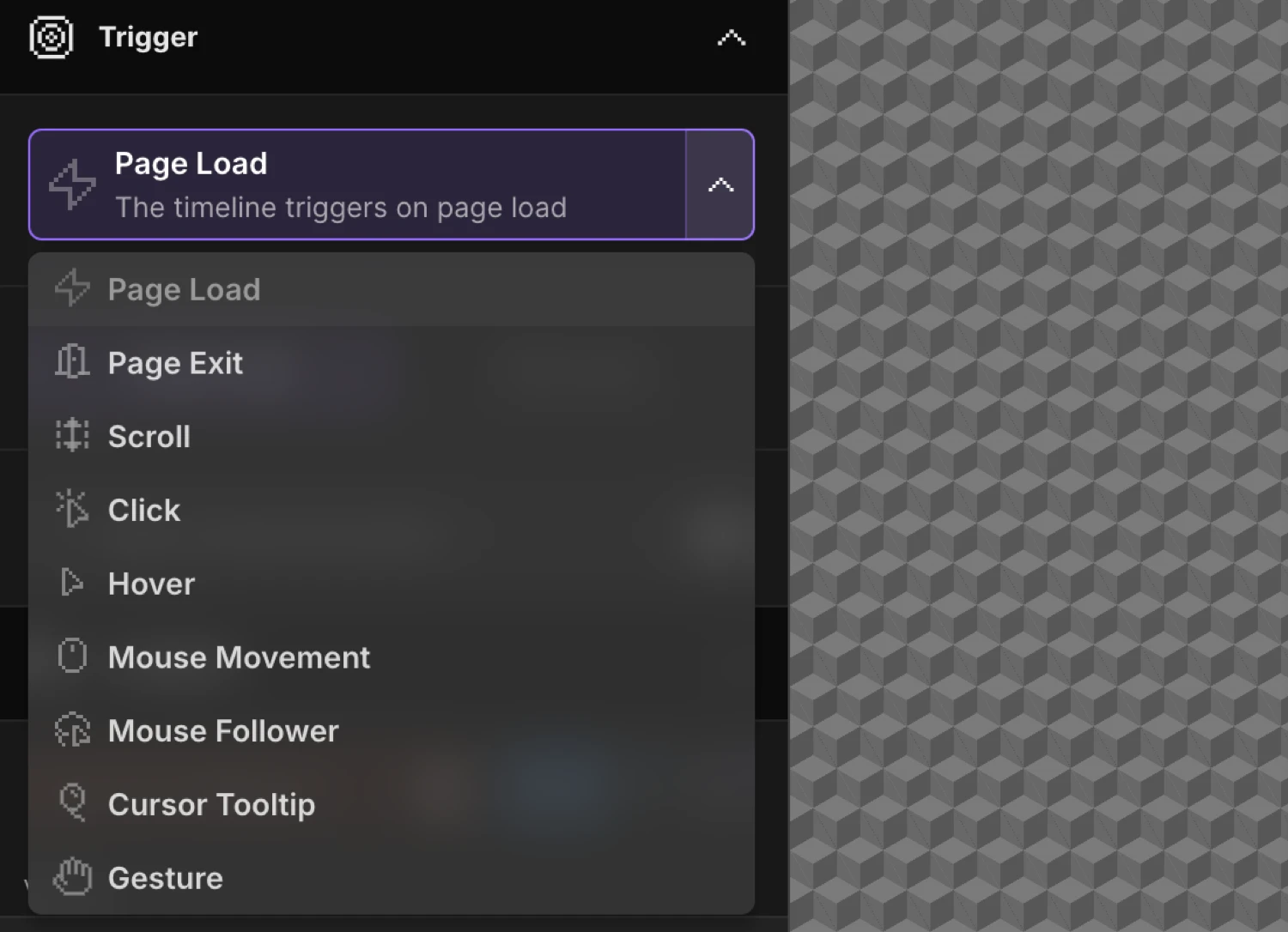
Trigger Types
| Trigger | Description |
|---|---|
| Page Load | Load the animation as soon as the JS is loaded. |
| Scroll | Soften the link between scrollbar and animation. Includes scrub, toggle actions, markers, pin, and offset options. |
| Hover | Play timeline on hover. Options for reverse on leave, restart on leave, reverse delay, and trigger selector. |
| Click | Play timeline on click. Options for reverse on re-click, restart on re-click, prevent default, and trigger selector. |
| Mouse Movement | Animate based on cursor position within viewport or a specific selector. Options for axis mode, distance mode, and smoothing. |
| Observer / Gesture | Detect pointer, touch, wheel, or scroll gestures. Includes presentation mode for full-page section scrolling. |
| Custom Cursor | Create a custom cursor with smooth movement, squeeze effect, and different states (default, hover, pressed). |
| Page Exit | Animate when user navigates away. Options for ignored classes and trigger selectors. |
Page Load
Fires immediately when the Motion.page script initialises on the page. No interaction required. Use this for entrance animations, hero reveals, and anything that should run as soon as the page is ready.
Scroll
Key options:
| Option | Description |
|---|---|
| Scrub | Links animation progress directly to scroll position. Set a numeric value to add inertia (e.g. 1 = 1s lag). |
| Toggle Actions | Define what happens when the scroll trigger enters, leaves, re-enters, and re-leaves the viewport. |
| Markers | Show debug markers for the start and end scroll positions. |
| Pin | Pin the trigger element while the animation plays. |
| Start / End offsets | Offset the trigger’s start and end points relative to the element and viewport. |
For full documentation see Scroll Trigger.
Hover
Plays the timeline when the pointer enters the trigger element.
| Option | Description |
|---|---|
| Reverse on leave | Reverses the timeline when the pointer leaves. |
| Restart on leave | Restarts from the beginning on the next hover instead of resuming. |
| Reverse delay | Delay in seconds before the reverse begins after the pointer leaves. |
| Trigger selector | Override the trigger element with a different CSS selector. |
Click
Plays the timeline when the trigger element is clicked.
| Option | Description |
|---|---|
| Reverse on re-click | Reverses the timeline when clicked again. |
| Restart on re-click | Restarts from the beginning on each click instead of reversing. |
| Prevent default | Calls event.preventDefault() — useful on links and form buttons. |
| Trigger selector | Override the trigger element with a different CSS selector. |
Mouse Movement
Animates properties in real time based on cursor position relative to the viewport or a container element.
| Option | Description |
|---|---|
| Axis mode | Animate on X, Y, or both axes. |
| Distance mode | Base animation progress on distance from the centre or from the edges. |
| Smoothing | Adds lerp-based lag to follow the cursor smoothly instead of snapping. |
Observer / Gesture
Detects pointer, touch, wheel, and scroll gestures and map them to timeline playback.
Key options include gesture direction, velocity threshold, and Presentation mode — a full-page section-scrolling mode that snaps between sections on scroll or swipe.
Custom Cursor
Replaces or augments the default browser cursor with a custom animated element that follows the pointer.
| Option | Description |
|---|---|
| Squeeze | Adds a squish deformation effect based on movement speed and direction. |
| Default state | Appearance of the cursor in its idle state. |
| Hover state | Appearance when hovering over designated elements. |
| Pressed state | Appearance when the mouse button is held down. |
Page Exit
Plays the animation when the user navigates away from the current page. Useful for exit transitions.
| Option | Description |
|---|---|
| Ignored classes | CSS classes on links that should not trigger the exit animation (e.g. anchors on the same page). |
| Trigger selectors | Limit which links trigger the exit animation. |
Breakpoints
At the bottom of the Left Panel, the Breakpoints selector controls which viewport sizes this animation is active on. Select the range of breakpoints where the animation is enabled.
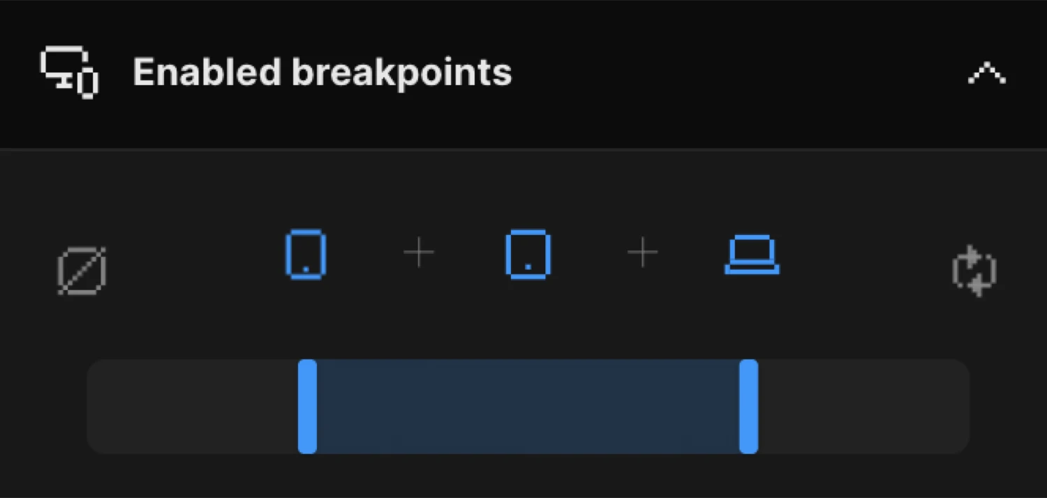
Breakpoint widths are configured in Global Settings → Breakpoints. Disabling an animation at a breakpoint hides it entirely at that viewport size — the elements remain but no animation timeline is created.
Related
- From, To & Set — Detailed explanation of the three animation modes and context menu options
- Scroll Trigger — Full ScrollTrigger configuration reference
- Workspace Overview — Tour of all four builder regions
- Opacity — Fade animations using the Opacity property
- Translate — Move elements on X and Y axes
- Scale — Resize elements uniformly or independently
- Stagger — Sequence multiple targets with per-element delay
- Ease — Control animation acceleration and deceleration
- Text Splitter — Character, word, and line splitting for staggered text reveals