Background Position
Animate background position for parallax and sliding background effects in the builder.
Background Position animates the background-position CSS property of an element — shifting the background image or gradient along the X and Y axes. It is the primary tool for building parallax depth effects, sliding background reveals, and looping texture animations.
Location
Left Panel → Animation tab → Visual Properties → Background Position
Enable Background Position
Click the toggle next to Background Position to enable it. The row expands to reveal two numeric inputs — one for the X axis and one for the Y axis.
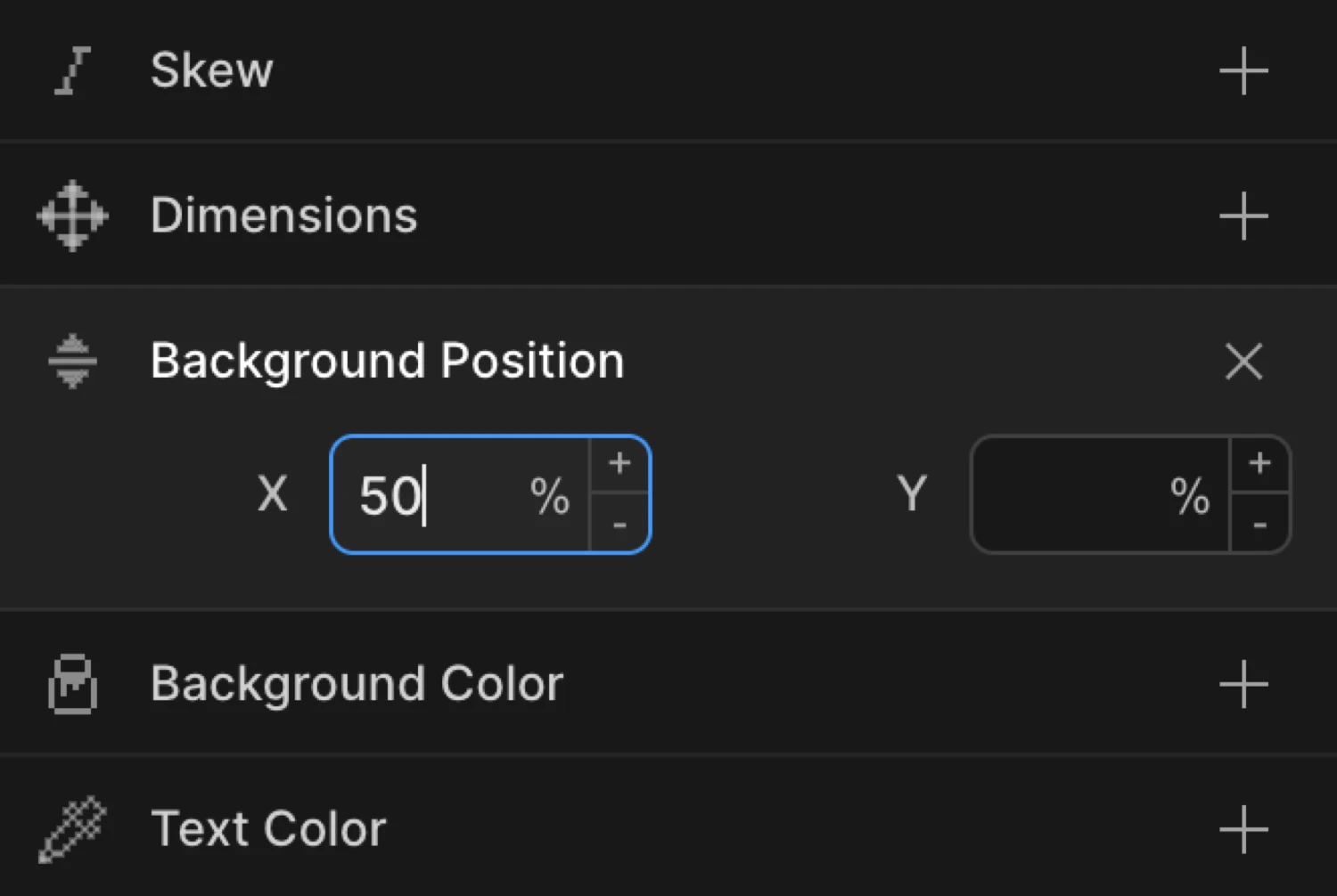
Controls
| Control | Unit | Default | Description |
|---|---|---|---|
| X | % or px | — | Horizontal background offset. Click the unit badge to toggle between % and px. |
| Y | % or px | — | Vertical background offset. Click the unit badge to toggle between % and px. |
Both inputs accept integers. Use the mouse wheel on a focused input to increment or decrement the value. Click the unit badge on either input to switch between percentage (%) and pixel (px) units.
50% places the background at the horizontal or vertical center. 0% aligns it to the left/top. 100% aligns it to the right/bottom. Pixel values shift the background by an absolute amount regardless of element size.
From mode — parallax entrance
Switch to the From tab, enable Background Position, and set a Y value such as -20 (%). The background starts shifted upward and eases into its natural CSS position on scroll or page load — the classic parallax entrance pattern.
Leave the X field empty if you only want vertical movement. Note the tip in the Tips section about setting up both fields for Y-only animations.
To mode — sliding background
Switch to the To tab, enable Background Position, and set an X value such as 100 (%). The background slides horizontally from its natural CSS position to the target value. Use this for hover effects, looping marquee-style textures, or exit reveals.
The gradient background shifts from 0% 0% (From value) to 100% 100% (To value), producing a smooth parallax-style colour sweep across the element.
SDK equivalent
background-position is not directly animatable via the standard from/to keys. Use custom properties to animate it via the SDK.
See Custom Properties.
Common patterns
Vertical parallax on scroll
Set the trigger to Scroll with Scrub enabled. Enable Background Position on the From tab, set Y to -30 (%), and leave X empty. As the user scrolls, the background image shifts upward relative to the element, creating a depth illusion.
Motion('parallax-bg', '.hero', {
  from: { backgroundPosition: '50% -30%' },
  duration: 1,
  ease: 'none',
}).onScroll({ scrub: true });
Horizontal sliding background
Enable Background Position on the To tab, set X to 100 (%). Set the trigger to Hover with Reverse on leave enabled. The background texture slides horizontally on hover and returns on mouse out.
Motion('slide-bg', '.card', {
  to: { backgroundPosition: '100% 50%' },
  duration: 0.6,
  ease: 'power2.inOut',
}).onHover({ each: true, onLeave: 'reverse' });
Looping background animation
Use Repeat with Yoyo enabled and Times set to -1. Set Background Position on the To tab with Y at 100 (%). The background cycles continuously — useful for animated gradients or looping texture panels.
Motion('loop-bg', '.banner', {
  to: { backgroundPosition: '50% 100%' },
  duration: 3,
  ease: 'sine.inOut',
  repeat: { yoyo: true, times: -1 },
}).onPageLoad();
Combined parallax and fade entrance
Enable Opacity at 0 and Background Position Y at -20 (%) on the From tab together. The section fades in while the background image rises — a subtle depth cue common in editorial hero sections.
Motion('hero-reveal', '.hero-section', {
  from: { opacity: 0, backgroundPosition: '50% -20%' },
  duration: 1,
  ease: 'power3.out',
}).onPageLoad();
Tips
- Y-only animation requires both fields to be set. If you only fill in the Y input and leave X empty, the background-position shorthand may resolve unexpectedly. Set the X value to your element’s current natural X position (e.g.
50%) alongside the Y value you want to animate. This is the behavior described in the builder tooltip. background-sizeaffects how position reads. For parallax effects you almost always wantbackground-size: coveror a size larger than the element — otherwise there is no overflow to reveal.- Percentage values are relative to the overflow area, not the element. A value of
50%centers the background regardless of image dimensions. - Pixel values give precise, element-size-independent offsets — useful when you need exactly
20pxof shift rather than a proportional amount. - Use Scrub on the Scroll trigger to tie background movement directly to the scroll position for the smoothest parallax feel.
Related
- From, To & Set — How the three animation modes work and when to use each
- Custom Properties — SDK approach for animating background-position
- Opacity — Combine with background position for layered reveal effects
- Translate — Move the element itself instead of its background
- Repeat — Loop or yoyo background animations
- Ease — Control the motion curve for smooth parallax feel