From, To & Set
Understand the three animation modes and how to switch between them.
Every animation node in the builder operates in one of three modes: From, To, or Set. These modes control which endpoint of the animation you’re defining — and which endpoint Motion.page reads automatically from the element’s live CSS.
The From / To / Set toggle
The toggle lives in the Left Panel → Animation tab, just above the list of animation properties. It’s a three-way switch that shows which mode is currently active.
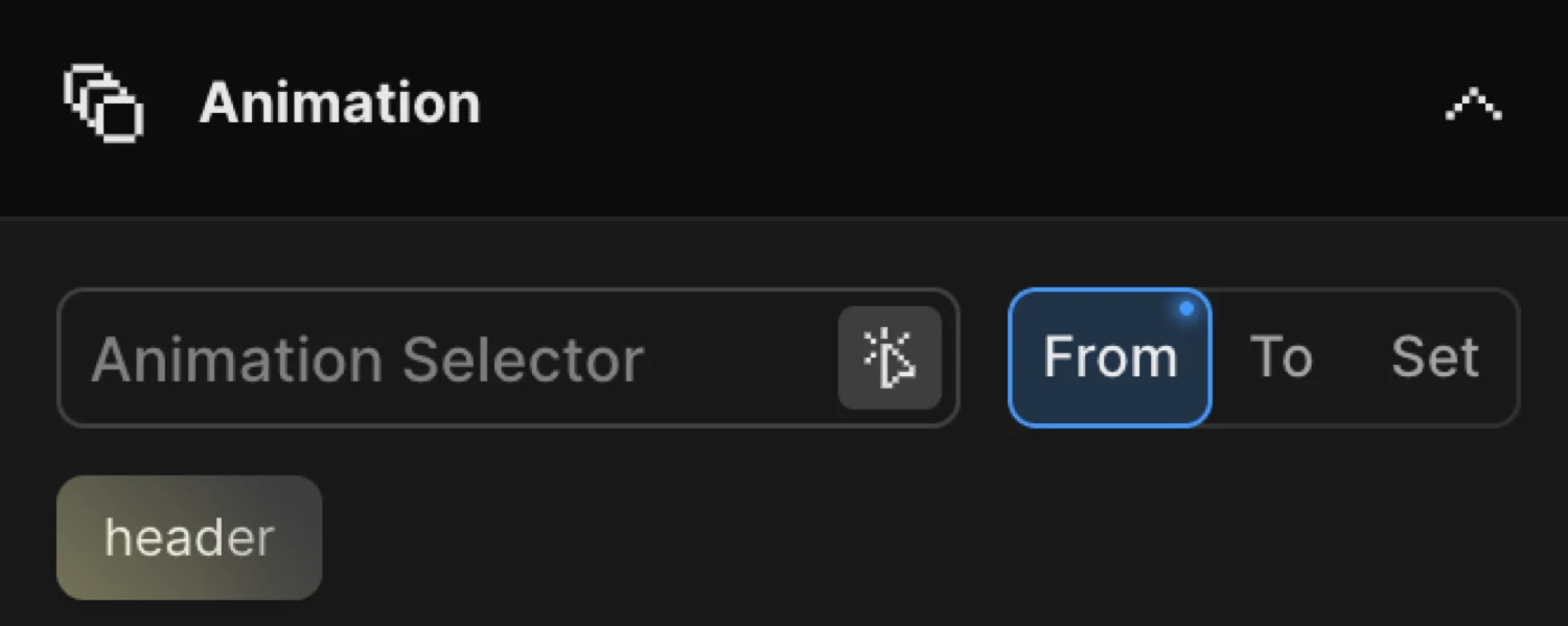
Click From, To, or Set to switch modes. A dot indicator appears on the button when that mode has properties configured. The property controls below the toggle always reflect the active mode’s values.
The three modes
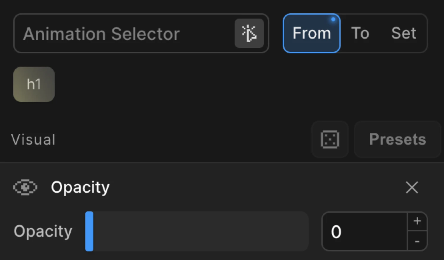
From
From defines the starting state of the animation. The element animates FROM these values toward its natural CSS state (or toward any values you’ve set in the To tab).
This is the most common mode for entrance animations — fade-ins, slide-ins, reveals. Set opacity to 0 and the element fades in from invisible to whatever its CSS opacity is. Set y to 60 and the element slides up into position.
Add animation properties as ‘FROM’. They will be a starting point of your animation, while an ending point are current values of the element or ‘To’ properties.
SDK equivalent:
import { Motion } from '@motion.page/sdk';

// Fade in: element starts at opacity 0, animates to its natural CSS opacity
Motion('fade-in', '.hero', {
  from: { opacity: 0, y: 60 },
  duration: 0.7,
  ease: 'power2.out',
}).onPageLoad();
To
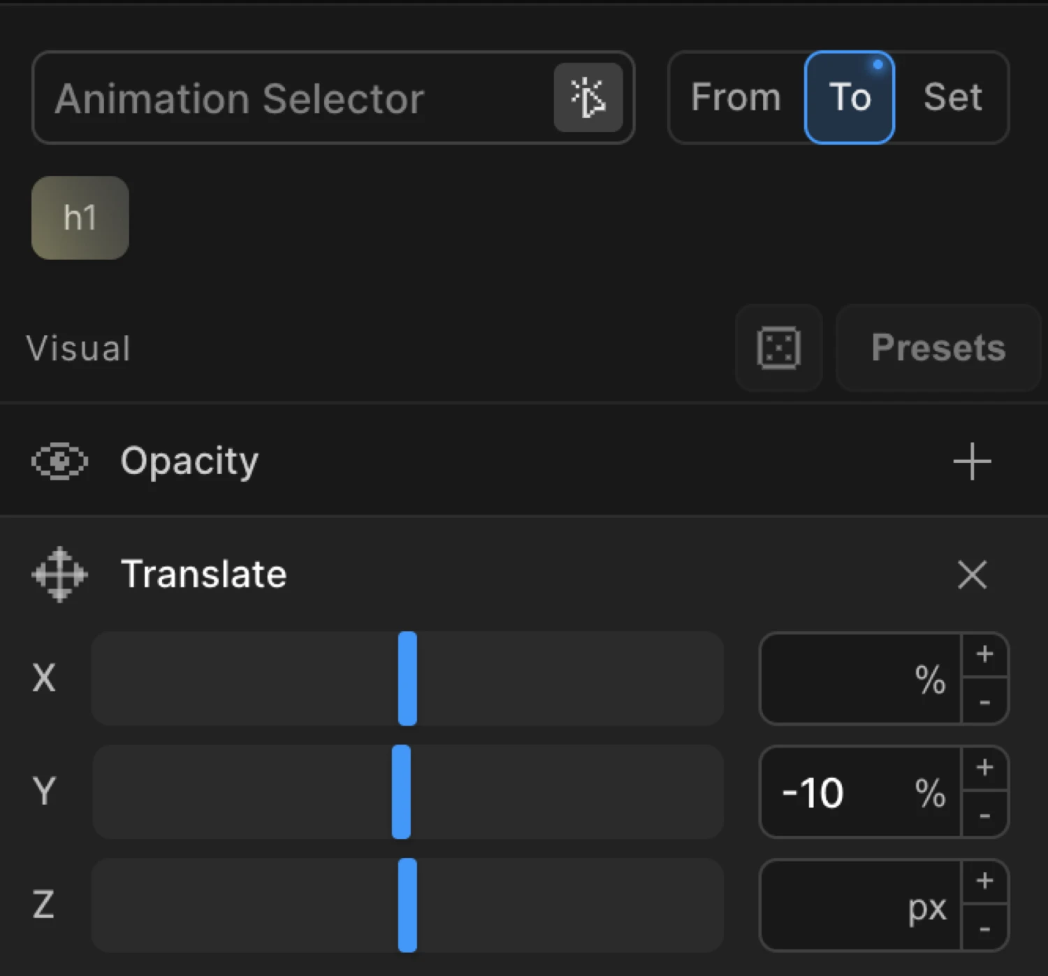
To defines the ending state of the animation. The element animates FROM its natural CSS state (or From values) TO these values.
Use To for hover effects, exit animations, or any situation where the element starts in its natural position and moves away from it.
Add animation properties as ‘TO’. They will be an ending point of your animation, while a starting point are current values of the element or ‘From’ properties.
SDK equivalent:
// Lift on hover: element starts at its natural position, moves up 10px
Motion('card-hover', '.card', {
  to: { y: -10, boxShadow: '0 16px 32px rgba(0,0,0,0.15)' },
  duration: 0.3,
  ease: 'power2.out',
}).onHover({ each: true, onLeave: 'reverse' });
Set
Set immediately applies property values with no animation. It acts as a zero-duration tween — the element snaps to the specified values the instant the timeline runs.
Add properties as ‘SET’. Acts as a zero-duration ‘TO’ tween, which immediately sets properties of the target(s) with no animation.
Use Set for:
- Initial state setup — hide or reposition elements before a sequence begins
- Instant state changes — snap to a new state without a visible transition
- Resetting properties between animation steps in a multi-node timeline
// Immediately set opacity to 0 — no fade, instant hide
Motion.set('.overlay', { opacity: 0 });
Using From and To together
You can configure both From and To simultaneously on the same animation node. Switch between the tabs to set values on each side — both will be active at the same time.
Use this when neither endpoint matches the element’s natural CSS state:
// Parallax: element travels from -50px to +50px — neither end is the natural position
Motion('parallax', '.section-image', {
  from: { y: -50 },
  to:   { y: 50 },
  duration: 1,
}).onScroll({ scrub: true });
When both are set, the SDK uses your explicit values for both endpoints instead of reading from the element’s CSS.
Implicit values (how the SDK fills in the missing endpoint)
When you configure only From, Motion.page reads the element’s current CSS as the To endpoint automatically. When you configure only To, the element’s current CSS becomes the From endpoint.
This means you almost never need to write redundant natural values:
| What you configure | What the SDK uses |
|---|---|
from only | to = element’s live CSS |
to only | from = element’s live CSS |
| Both | Both endpoints are explicit |
Natural CSS defaults that you never need to specify in to:
opacity: 1 · x: 0 · y: 0 · z: 0 · scale: 1 · rotate: 0
// ✅ Correct — drop the redundant to
Motion('reveal', '.card', {
  from: { opacity: 0, y: 40 },
  duration: 0.6,
});

// ❌ Redundant — opacity:1 and y:0 are natural defaults
Motion('reveal', '.card', {
  from: { opacity: 0, y: 40 },
  to:   { opacity: 1, y: 0 },   // unnecessary
  duration: 0.6,
});The purple box uses from: { opacity: 0, y: 16 } — it starts hidden and slides into its natural position. The orange box uses to: { opacity: 0.2, y: -12 } — it starts in its natural position and animates away.
Context menu options
Right-click on the From or To label to access extra operations:
| Option | Description |
|---|---|
| Duplicate | Copy all properties from this tab into the opposite tab (From → To, or To → From) |
| Toggle | Swap all properties between From and To — useful when you set them on the wrong tab |
| Clear | Remove all properties from this tab |
| Copy | Copy the tab’s properties to clipboard (compressed) |
| Paste | Paste previously copied properties into this tab |
Right-clicking the Set tab exposes Duplicate, Clear, Copy, and Paste (Toggle is not applicable to Set).
Functional properties are shared
Properties in the Functional section — such as Stagger, Repeat, Ease, Text Splitter, and Fit — are direction-agnostic. They appear and behave the same regardless of which tab is active. Changing them on the From tab has the same effect as changing them on the To tab.
Related
- Opacity — fade in/out using From or To
- Translate — slide elements on X and Y
- Scale — grow or shrink elements
- Ease — control acceleration and deceleration
- From / To resolution in the SDK