Timeline Editor
Visual timeline — nodes, duration, sequencing, drag-to-resize, and playhead controls.
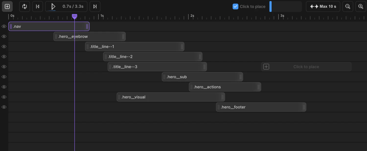
The Timeline Editor is the horizontal panel at the bottom of the builder workspace. It gives you a visual representation of your animation sequence — every animated target appears as a node on a time axis you can drag, resize, and rearrange.
Nodes
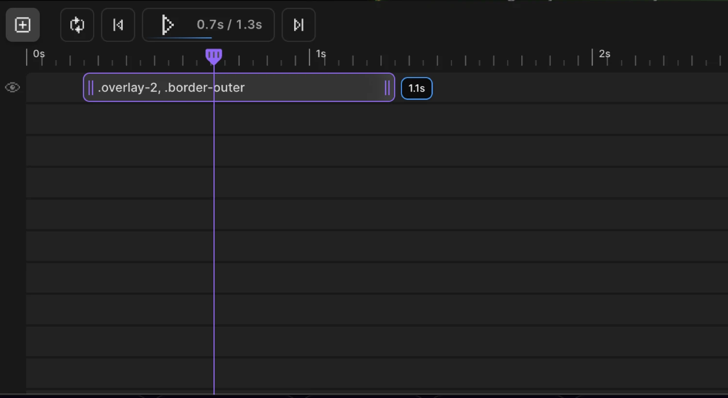
Each node represents one animated target — a CSS selector and the animation properties assigned to it. The node’s horizontal position sets when the animation starts; its width sets how long it runs.
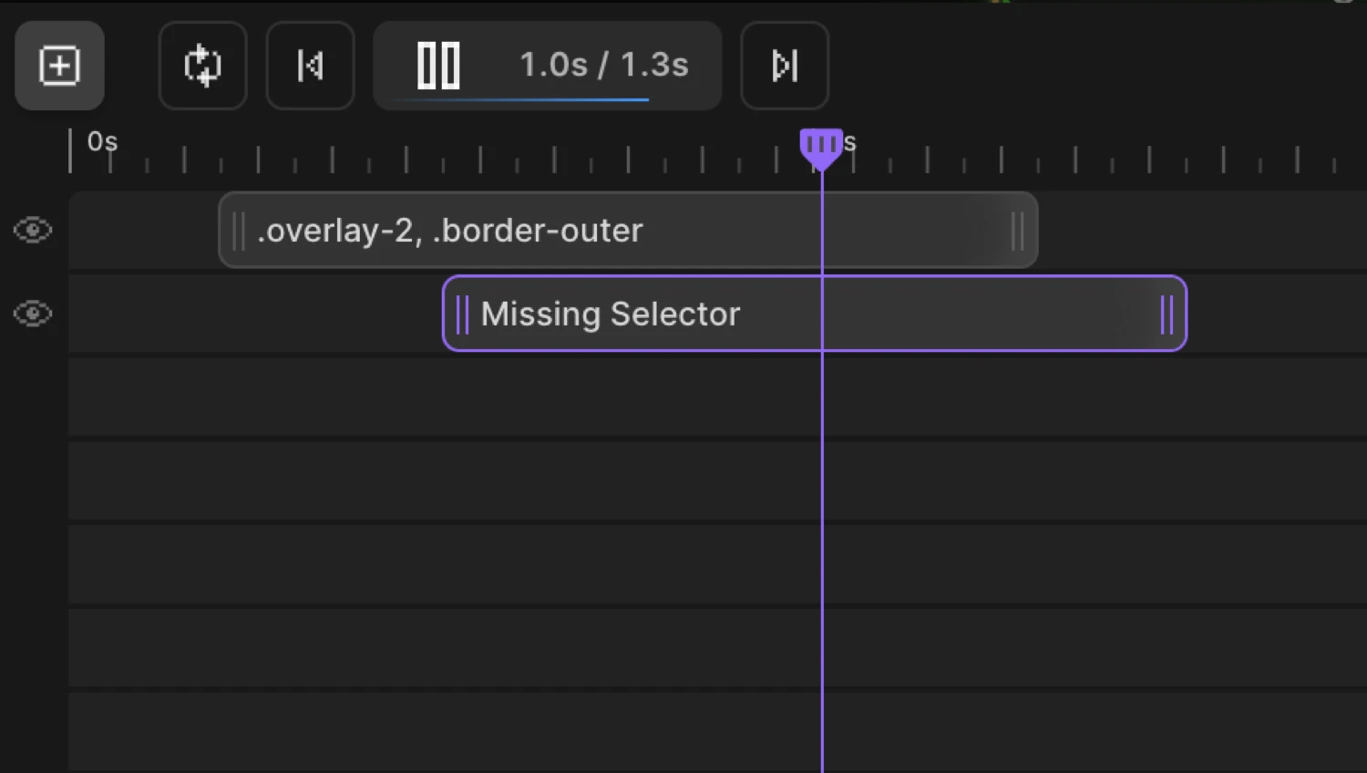
The node label shows the CSS selector (e.g. .hero, .card, .title). If no selector has been assigned yet, it reads “Missing Selector” as a reminder to wire it up.
Nodes communicate state through their appearance:
| State | Visual |
|---|---|
| Active — the node currently open in the Left Panel | Highlighted outline |
| Selected — part of a multi-select group | Blue outline |
| Collision — overlapping another node in the same row | Red “Collision!” warning |
| Hidden — the row’s visibility is off | Reduced opacity |
Two small icons can appear inside a node:
- Grid icon — a stagger with
eachoramountis configured - Repeat icon — a
repeat.timesvalue is set
Click a node to make it active and open its properties in the Left Panel.
Duration — drag to resize
Drag the left or right edge of a node to change its duration. The resize handle is 20px wide, centered on the edge. As you drag, a duration tooltip appears above (or below) the node showing the current duration — for example 1.5s.
Nodes snap to 0.1 second increments while resizing, so you always land on a clean value. Resizing from the left edge also shifts the node’s start position to keep the right edge anchored.
The default node width is 1 second. Internally, 250 px = 1 second, so duration = width / 250.
This maps directly to the duration parameter in the SDK:
Motion("hero-reveal", ".hero", {
  from: { opacity: 0, y: 40 },
  duration: 1.5,   // ← matches what you set by resizing the node
}).onPageLoad();
Position — drag to move
Drag a node left or right to shift its start time. The same 0.1 second snap grid applies. Drag a node vertically to move it to a different row — useful for grouping animations or controlling render order.
Collision detection prevents nodes from overlapping in the same row. If you drop a node onto another, it shows a red “Collision!” warning and snaps back to the last safe position.
This corresponds to the position parameter in the SDK:
Motion("stagger-cards", ".card", {
  from: { opacity: 0 },
  duration: 0.6,
  position: 0.3,   // ← start 0.3 s into the timeline, set by dragging the node
}).onPageLoad();
Adding nodes
Click the + button in the timeline top bar (“Add an animation node”) to add a new node at the beginning of the timeline, then drag it into place.
Click-to-place mode (enabled by default) is a faster alternative: a ghost node follows your cursor across empty timeline space, showing a plus icon and “Click to place” text. The ghost snaps to the 0.1 s grid and is collision-aware — it won’t appear on occupied positions. Click to create a node at that exact spot.
Toggle click-to-place on or off with the grid-cursor button in the top bar (“Toggle click-to-place nodes on timeline”). The setting is saved to localStorage across sessions.
Deleting and duplicating nodes
Right-click a node to open the context menu:
| Action | Description |
|---|---|
| Delete Animation | Removes the node from the timeline |
| Duplicate | Creates an identical copy directly after the original |
When multiple nodes are selected, both actions apply to all selected nodes at once. After a delete, the selection clears and the first remaining node becomes active.
Playhead and playback controls
The playhead is the red vertical line that marks the current playback position. Drag it left or right to scrub through the animation. Click anywhere on the ruler — the seconds axis along the top of the timeline — to jump the playhead to that moment.
The ruler labels each column with its time in seconds: 0s, 1s, 2s, and so on.
Playback buttons
The top bar contains the full set of playback controls:
| Button | Tooltip | Action |
|---|---|---|
| Loop toggle | ”Preview in a loop” | When on, the animation restarts at the end |
| ⏮ | “Jump to start” | Seeks to 0 s |
| ▶ / ⏸ | “Play / Pause” | Starts or pauses playback |
| ⏭ | “Jump to end” | Seeks to the last frame |
The Play / Pause button also shows a time display — {current}s / {total}s — with a thin progress bar running along its bottom edge. When the timeline contains an infinitely repeating animation, the total shows ∞ instead of a number.
Live mode
The Live button (with a dot indicator) plays the animation on the actual page using the real trigger — scroll position, click, or hover — instead of the builder’s internal playback engine. Enable Live mode when you need to see exactly how a scroll-linked or interaction animation will feel in context.
“If enabled, animations are executed live on the page for preview of a trigger (scroll, click, hover).” Live mode is disabled automatically for Page Events triggers.
Zoom
Use the Zoom In (+) and Zoom Out (−) buttons in the top bar to adjust the timeline scale:
| Setting | Value |
|---|---|
| Default zoom | 1× — 250 px = 1 second |
| Minimum | 0.2× (Zoom Out disabled at this level) |
| Maximum | 3.4× (Zoom In disabled at this level) |
| Step per click | 0.2 |
Hold the button down for long-press — it repeats every 200 ms so you can sweep across the full range quickly. The zoom level is saved to localStorage and restored when you reopen the builder.
Zoom affects the visual width of every node, the drag and resize snap grids, the ruler column labels, and the playhead’s pixel position. The underlying position and duration values in seconds are not changed.
Multi-select
Select multiple nodes to move or delete them together:
- Click a node — selects it and deselects all others
- Ctrl + Click (or Cmd + Click on Mac) — adds or removes a node from the selection without deselecting others
When you drag one node in a multi-select group, all selected nodes move together by the same delta. Collision detection runs per-node during the drag — nodes that would collide revert to their last safe position while the rest keep their new positions.
Right-click context menu actions (Delete, Duplicate) apply to all selected nodes when multi-select is active.
Row visibility
An eye icon appears on the left edge of each row. Click it to show or hide all nodes on that row during preview:
- Eye open — row is visible, animations play normally
- Eye closed — row is hidden, all nodes appear at reduced opacity and their CSS animations are cleared from the page
Hiding a row calls clearProps on every animated selector in that row, resetting the elements to their natural CSS state. The visibility state is stored per-node and round-trips through save/load.
Timeline length
The timeline defaults to 10 seconds. Click the “Max N s” button in the top bar to extend it:
| Click | Timeline length |
|---|---|
| 1st | 20 s |
| 2nd | 30 s |
| … | … |
| 6th | 70 s (maximum) |
| 7th | Wraps back to 10 s |
The button label always reflects the current maximum — Max 10 s, Max 20 s, etc.
Undo and redo
| Action | Shortcut |
|---|---|
| Undo | Cmd+Z / Ctrl+Z |
| Redo | Cmd+Shift+Z / Ctrl+Shift+Z |
| Clear all history | Button in the top bar (“Clear all undo/redo history”) |
Timeline management
The top bar also contains controls for managing the timeline itself:
| Control | Tooltip | Description |
|---|---|---|
| Name field | ”Rename the timeline.” | Click to rename — used as the timeline identifier in the SDK |
| Global toggle | ”If enabled, the timeline will load on all pages.” | When on, the timeline runs everywhere rather than only on the page it was created on |
| New button | ”Create a new timeline” | Adds a fresh, empty timeline |
| Duplicate button | ”Duplicate timeline” | Creates an exact copy of the current timeline |
Related: Duration & Delay · Sequencing · Timeline Control · Stagger · Repeat & Yoyo