Text Flapper
Create Solari split-flap display effects that cycle through characters before landing on the target text.
Text Flapper animates text like a mechanical Solari departure board — each character cycles through random intermediate glyphs before landing on the final text. Choose from seven transition styles, configure the character set and cycle count, and optionally enable full styled-board tile rendering.
Solari split-flap display effect that cycles through random characters before landing on the target text. Choose a transition type, character set, cycle count range, and perspective. Use the ‘Board’ type for a realistic departure-board look with styled panels.
Location
Left Panel → Animation tab → Functional Properties → Text Flapper
Text Flapper is a functional property — it is direction-agnostic. The same flap config applies whether the From, To, or Set tab is active. Enabling it on any tab enables it on all three. The data key in the animation config is flap.
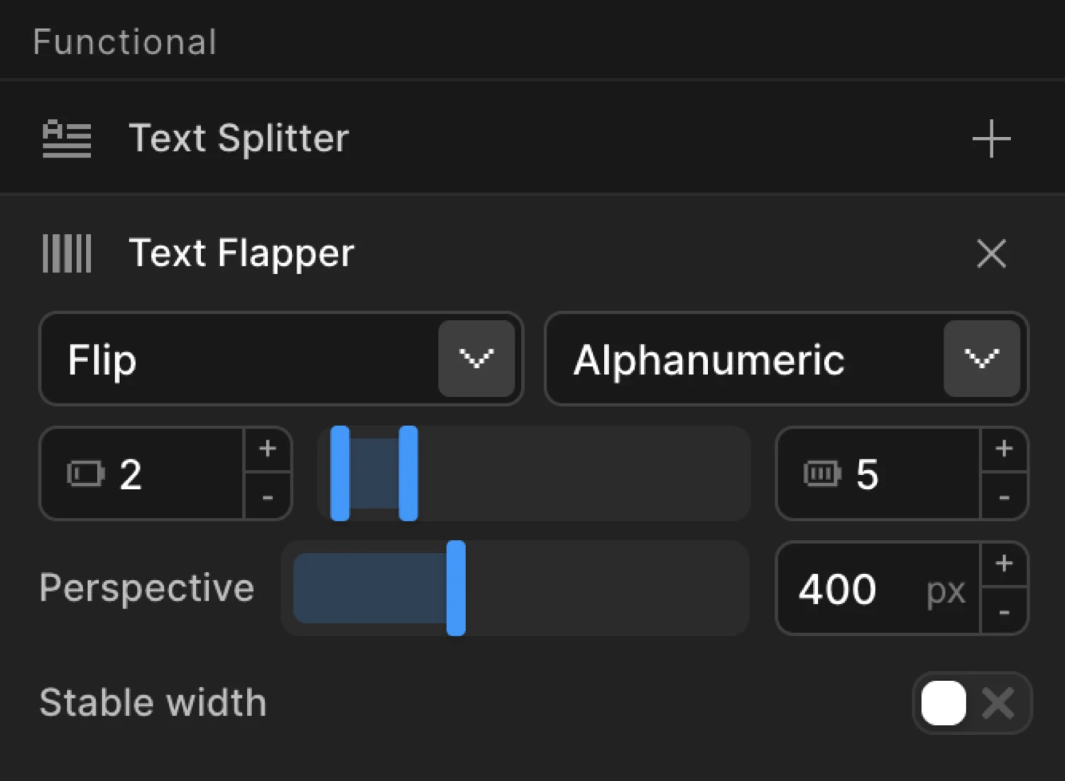
Enable Text Flapper
Click the toggle next to Text Flapper to enable it. The row expands to reveal the Type dropdown, Charset picker, Cycles range inputs, Perspective input, and the Styled Board and Preserve Whitespace toggles.
Note: Text Flapper operates on individual characters. It automatically splits text into characters internally — you do not need to enable Text Splitter separately. However, if you do add Text Splitter, it overrides the internal split, letting you reconfigure it (e.g. split into both characters and words).
Controls
| Control | Type | Default | Description |
|---|---|---|---|
| Type | Dropdown | flip | Animation style for each character transition. See Transition Types below. |
| Charset | Dropdown / text input | alphanumeric | Character pool used for the random cycling animation. Pick a preset or enter custom characters. |
| Cycles Min | Number input | 2 | Minimum number of random-character cycles before landing on the target letter. |
| Cycles Max | Number input | 5 | Maximum number of random-character cycles. Each letter in the text draws independently from the min–max range, adding organic variation. |
| Perspective | Number input | 400 | CSS perspective distance in pixels for the 3D flip and board transitions. Lower values create a more dramatic, compressed 3D effect. Only applies to flip and board types. |
| Styled Board | Toggle | On | Applies a dark gradient background with a split-line gap to each character tile for a realistic departure-board appearance. Only applies to the board type. |
| Preserve Whitespace | Toggle | Off | Renders whitespace characters as empty board cells instead of skipping them. Produces fixed-width rows like a real departure board. Only applies to the board type. |
Transition Types
Seven styles are available in the Type dropdown. All are per-character transitions — the surrounding from/to animation still applies on top.
| Type | Description |
|---|---|
flip | Each character rotates on the X axis like a physical flip card. Uses CSS 3D perspective — adjust Perspective for depth. |
fade | The outgoing character fades out, the incoming fades in. Owns the opacity property — avoid setting opacity in From/To when using this type. |
slide | Characters slide vertically in and out, clipped by an overflow: hidden parent. Produces a slot-machine feel. |
blur | Characters blur in and out between cycles. Owns the filter property — avoid setting filter in From/To when using this type. |
scale | Characters scale up and down between each cycle — a sharp, punchy pop effect. |
board | Full mechanical split-flap effect. Each character is restructured into layered top/bottom panels that fold at the center split line. The most realistic type — pair with Styled Board for the complete tile look. |
none | No built-in visual transition. Characters cycle through the charset without animation. Combine with your own From/To properties for full custom control. |
Each tile flips through random characters before snapping to its target. This mimics the board transition type with Styled Board enabled — dark gradient tiles, split-line divider, and staggered timing per character.
Charset Options
The Charset control sets the pool of characters used for random intermediate glyphs. Select a preset from the dropdown or type any custom string — every character in the string is drawn from at random.
| Preset | Characters used |
|---|---|
alphanumeric | ABCDEFGHIJKLMNOPQRSTUVWXYZ0123456789 |
alpha | ABCDEFGHIJKLMNOPQRSTUVWXYZ |
numeric | 0123456789 |
hex | 0123456789ABCDEF |
binary | 01 |
katakana | Full katakana syllabary (ア–ン) |
symbols | !@#$%^&*+-=<>?/|~ |
blocks | ░▒▓█▄▀■□▪▫ |
| Custom | Any string — type directly into the charset input |
Choose numeric for a score counter, katakana for a cyberpunk/matrix look, or blocks for a loading-indicator feel.
Common Patterns
Airport departure board
The canonical use case: Type → board, Styled Board on, Preserve Whitespace on (when row text includes spaces). Add Stagger each 0.05 for the classic cascade effect. Text Flapper handles character splitting automatically — no need to add Text Splitter separately.
import { Motion } from "@motion.page/sdk";

// split: 'chars' is auto-applied when flap is set — no need to add it manually
Motion("departures", ".board-header", {
  flap: { type: "board", styledBoard: true, preserveWhitespaceCells: true },
  stagger: 0.05,
  duration: 0.9,
}).onPageLoad();
Subtle text decode reveal
For a lighter touch — no heavy tile styling, just a quick scramble before the real text settles in. Use Type → fade, set Cycles to 2–4, and keep Duration short.
Motion("decode", ".hero-headline", {
  flap: { type: "fade", charset: "alphanumeric", cycles: [2, 4] },
  stagger: { each: 0.03, from: "random" },
  duration: 0.6,
}).onPageLoad();
Slot machine / score counter
Use Type → slide, Charset → numeric, and a higher cycle count so the digits visibly roll before landing.
Motion("score", ".score-value", {
  flap: { type: "slide", charset: "numeric", cycles: 10 },
  stagger: 0.08,
  duration: 1.2,
}).onPageLoad();
Cyber / matrix scramble
Type → fade, Charset → katakana, Stagger → random for an organic decode order. Works well as a scroll-triggered reveal.
Motion("matrix", ".terminal-output", {
  flap: { type: "fade", charset: "katakana", cycles: [4, 8] },
  stagger: { each: 0.03, from: "random" },
  duration: 1,
}).onScroll({ toggleActions: "play none none none", start: "top 80%" });
SDK Equivalent
Text Flapper maps to the flap property in the SDK config. Full documentation, including the stableWidth option and board type internals, is available on the SDK reference page.
Builder controls → SDK mapping:
| Builder control | SDK property |
|---|---|
| Type | flap.type |
| Charset | flap.charset |
| Cycles Min / Max | flap.cycles (number or [min, max] tuple) |
| Perspective | flap.perspective |
| Styled Board | flap.styledBoard |
| Stable width | flap.stableWidth (false · true/'cells' · 'container') |
| Preserve Whitespace | flap.preserveWhitespaceCells |
Stable width modes
The Stable width dropdown offers three strategies for preventing layout shift while the characters cycle:
- Off — no pinning; text width flexes naturally. Fine for same-width charsets.
- Per cell — each character cell is pinned to the widest glyph (target + charset). Classic split-flap monospace look.
- Per container — only the animated element’s outer width is reserved; letters flow at natural spacing inside. Best for inline hover flappers on nav links where per-cell pinning would visibly space out Latin letters.
import { Motion } from "@motion.page/sdk";

Motion("board", ".departure-title", {
  flap: {
    type: "board",
    charset: "alphanumeric",
    cycles: [3, 7],
    perspective: 400,
    styledBoard: true,
    preserveWhitespaceCells: true,
  },
  stagger: 0.05,
  duration: 0.9,
}).onPageLoad();
For the full SDK reference, see Text Flapper in the SDK.
Related
- Text Splitter — Optional: Text Flapper auto-splits into characters internally. Add Text Splitter only to reconfigure the split (e.g. include words or lines)
- Stagger — Control the cascade timing between each flapping character
- From, To & Set — How functional properties apply across animation mode tabs