Opacity
Configure opacity animations in the builder UI.
Opacity animates the transparency of an element — from fully visible (1) to fully invisible (0), or anywhere in between. It is the simplest way to build fade-in and fade-out effects in the builder.
Location
Left Panel → Animation tab → Visual Properties → Opacity
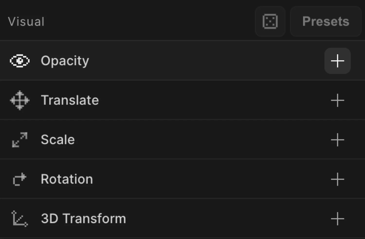
Enable opacity
Click the toggle next to Opacity to enable it. The row expands to reveal the opacity slider.
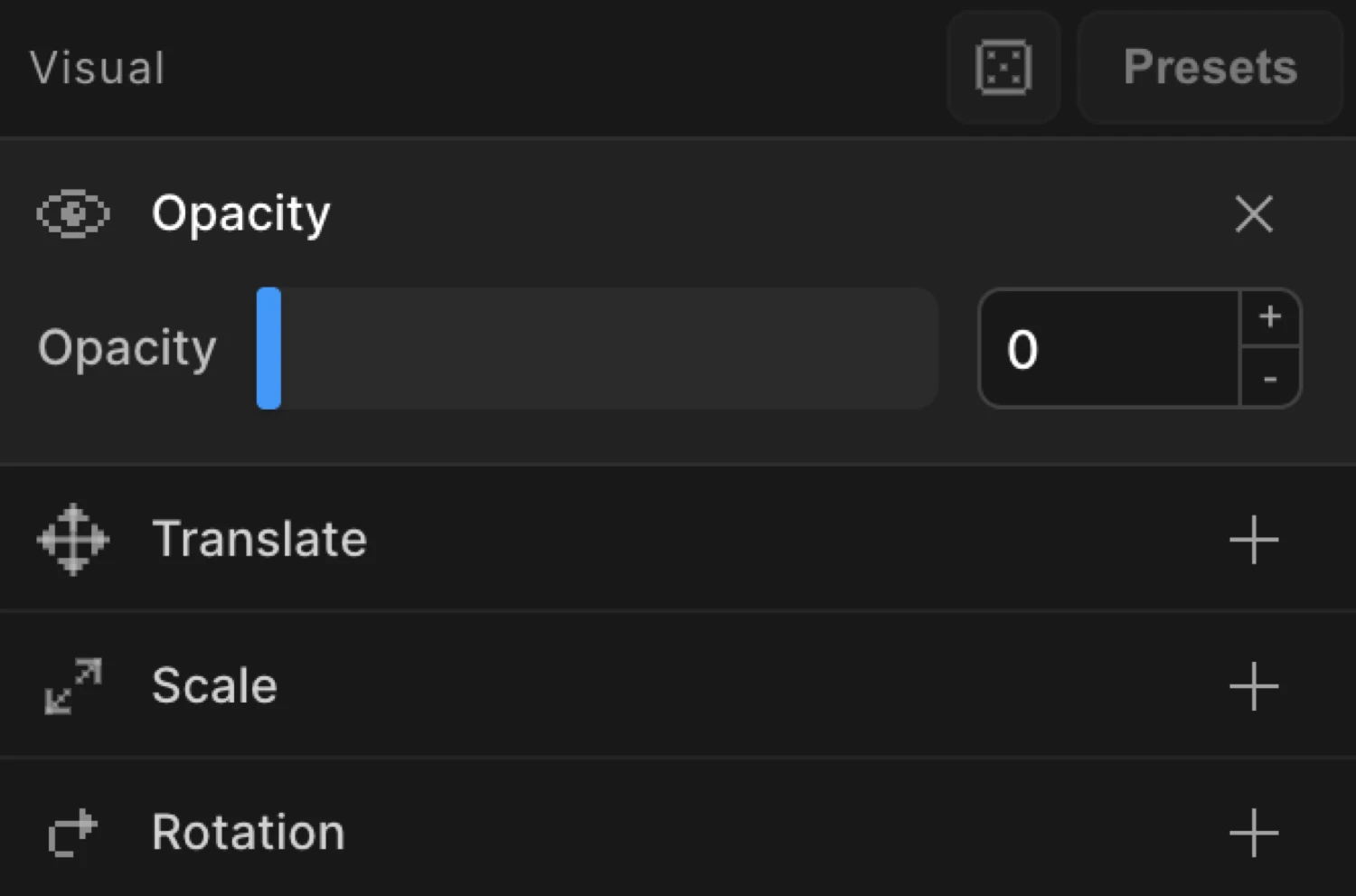
Controls
| Control | Range | Default | Description |
|---|---|---|---|
| Slider | 0 – 1 | — | Drag to set the opacity value. Steps in increments of 0.1. |
| Numeric input | 0 – 1 | — | Type an exact value. Accepts decimals (e.g. 0.35). |
Values outside 0–1 are ignored. Double-click the input to reset it.
From mode — fade in
Switch to the From tab, enable Opacity, and set the value to 0. The element starts invisible and animates to its natural CSS opacity (typically 1).
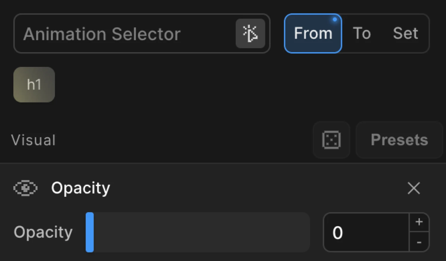
This is the most common opacity pattern: the element is invisible at the start and fades into view.
To mode — fade out
Switch to the To tab, enable Opacity, and set the value to 0. The element starts at its natural CSS opacity and fades out to invisible.

Use To for exit animations, hover dim effects, or any case where the element should start visible and become less so.
The box starts at opacity: 0 (the From value) and animates to opacity: 1 — its natural CSS state.
SDK equivalent
The opacity property maps directly to the SDK’s from and to objects.
Fade in (From mode):
import { Motion } from '@motion.page/sdk';

Motion('fade-in', '.hero', {
  from: { opacity: 0 },
  duration: 0.8,
  ease: 'power2.out',
}).onPageLoad();
Fade out (To mode):
Motion('fade-out', '.modal', {
  to: { opacity: 0 },
  duration: 0.5,
  ease: 'power1.in',
}).onClick({ selector: '.close-btn' });
Both From and To — explicit endpoints:
// Animate from 0.2 to 0.8 — neither end is the natural CSS value
Motion('dim-reveal', '.card', {
  from: { opacity: 0.2 },
  to:   { opacity: 0.8 },
  duration: 0.6,
}).onScroll({ scrub: true });
For the full SDK reference, see Opacity in the SDK.
Common patterns
Fade in on scroll
Enable Opacity on the From tab, set it to 0. Set the trigger to Scroll with Toggle Actions set to play pause resume reset. The element fades in when it enters the viewport.
Motion('scroll-fade', '.section', {
  from: { opacity: 0 },
  duration: 0.7,
  ease: 'power2.out',
}).onScroll();
Fade in with a vertical slide
Combine Opacity and Translate on the same From tab. Set opacity to 0 and y to 40. The element fades in while rising into place — a common reveal pattern.
Motion('slide-fade', '.card', {
  from: { opacity: 0, y: 40 },
  duration: 0.6,
  ease: 'power2.out',
}).onScroll();
Fade out on exit
Set the trigger to Page Exit. Enable Opacity on the To tab and set it to 0. The page fades out when the user navigates away.
Motion('page-exit', 'body', {
  to: { opacity: 0 },
  duration: 0.4,
  ease: 'power1.in',
}).onPageExit();
Hover dim
Enable Opacity on the To tab, set it to 0.5. Set the trigger to Hover with Reverse on leave enabled. The element dims on hover and returns to full opacity on mouse out.
Motion('hover-dim', '.thumbnail', {
  to: { opacity: 0.5 },
  duration: 0.25,
  ease: 'power1.out',
}).onHover({ each: true, onLeave: 'reverse' });
Related
- From, To & Set — How the three animation modes work and when to use each
- Opacity in the SDK — SDK reference for the
opacityproperty - Translate — Move elements on X and Y axes
- Ease — Control acceleration and deceleration