Responsive Editing
Tune a single timeline per device with cascading overrides — no duplicate timelines required.
Responsive Editing lets one timeline look different on every device. Instead of building a separate animation for desktop, laptop, tablet, and phone, you edit a single timeline and store only the values that change per device as overrides. Everything else cascades down from the wider device automatically.
What it is
A timeline has four device tiers — desktop, laptop, tablet, and phone. You pick a device, change a value, and that change is saved as an override for that device only. Overrides cascade from the widest screen to the narrowest:
desktop → laptop → tablet → phone
A tier with no override of its own inherits the value from the closest wider tier. Set a value on desktop and it applies everywhere; override it on tablet and tablet and phone follow the new value while desktop and laptop keep the original. This replaces the old approach of duplicating a timeline once per device and guarding each copy with a media query.
Note: Cascading means you usually only touch the desktop values, then make a few small adjustments on smaller screens. The narrower the device, the fewer overrides you typically need.
How to use it
-
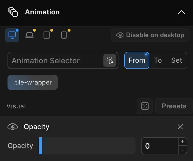
Switch device in the Top Panel
Use the device switcher in the center of the Top Panel to select desktop, laptop, tablet, or phone. The Frame View resizes to that breakpoint’s width so you see the page exactly as that device will. The currently selected device determines which tier your edits are saved to.
-
Edit values
Change any animation property — opacity, translate, duration, easing, anything in the Left Panel. While a non-desktop device is selected, only the values you actually change are stored as overrides for that device. Untouched values stay inherited.
-
Let the overrides cascade
Your edits flow downward through desktop → laptop → tablet → phone. A value set on a wider device is the default for every narrower device until one of them overrides it. You never re-enter values that don’t change between devices.
Seeing what’s overridden
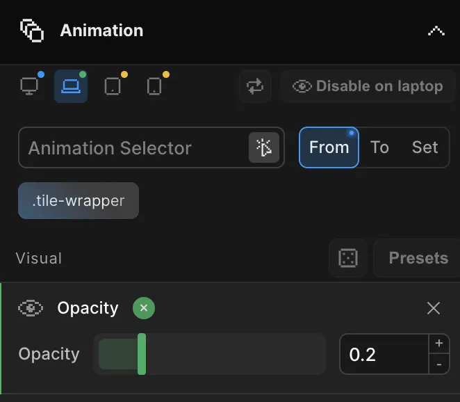
Each animated element shows a breakpoint indicator row that maps to the four device tiers. The indicators make it obvious, at a glance, where a value is inherited and where it has been overridden:
- An override marker highlights any property that has its own value on the current device, rather than inheriting from a wider one.
- Inherited values show no marker — they’re following the cascade.
- A one-click reset on an override removes it and returns the property to its inherited value. The element instantly falls back to whatever the wider device defines.
This lets you audit a responsive timeline quickly: anything marked is intentional per-device tuning; anything unmarked is shared.
Hiding an element per device
Sometimes an animation shouldn’t run at all on certain screens — a heavy parallax that doesn’t suit phones, or a hover effect that has no place on touch devices. On any device tier you can hide or disable an element’s animation for that tier.
A disabled element simply doesn’t animate on the devices where it’s turned off, while continuing to animate normally on the others. Like every other override, this is per-tier and cascades, so disabling on tablet also affects phone unless phone re-enables it.
Tip: Disable hover-driven animations on tablet and phone — touch screens have no hover state, so the effect would never trigger there anyway.
Live preview
Every change is reflected immediately. As you switch devices in the Top Panel, the Frame View swaps to that viewport and replays the timeline with that device’s resolved values — no rebuild, no reload. You’re always previewing the exact animation a visitor on that device will see.
On the published site, the same behavior is live: the correct device variant is selected from the viewport width, and the animation swaps instantly if the viewport crosses a breakpoint boundary (for example, when a tablet is rotated or a desktop window is resized).
Related
- Breakpoint Sizes — Set the pixel thresholds that define each device tier
- Responsive Animations (SDK) — The developer-facing
Motion.responsive()equivalent - Top Panel — The device switcher and preview controls
- Left Panel — Where animation values and overrides are edited